RoleIn this project, Leo (UI designer) and I collaborated on redesigning a platform section. While Leo concentrated on UI aspects, I focused on refining flow, information architecture, and navigation. Working closely with PM Tina and sales managers ensured thorough user-centric coverage of needs.Duration 3/5 months
Utilities 2021
Team
- Product Director
- Senior UX Designer
- UI/UX Designer
- Product Manager
- Developer
Tools
Figma, Slack, Usertesting.com, Jira

Introduction
Overview
Utility providers need to address customer demands by adopting advanced technology to efficiently assist and resolve customer queries and issues.


Utility providers are facing significant challenges due to the growing complexities of the industry, shifting customer expectations, and the need to improve technology and operational systems to better assist their customers promptly and efficiently.
Introduction
Task
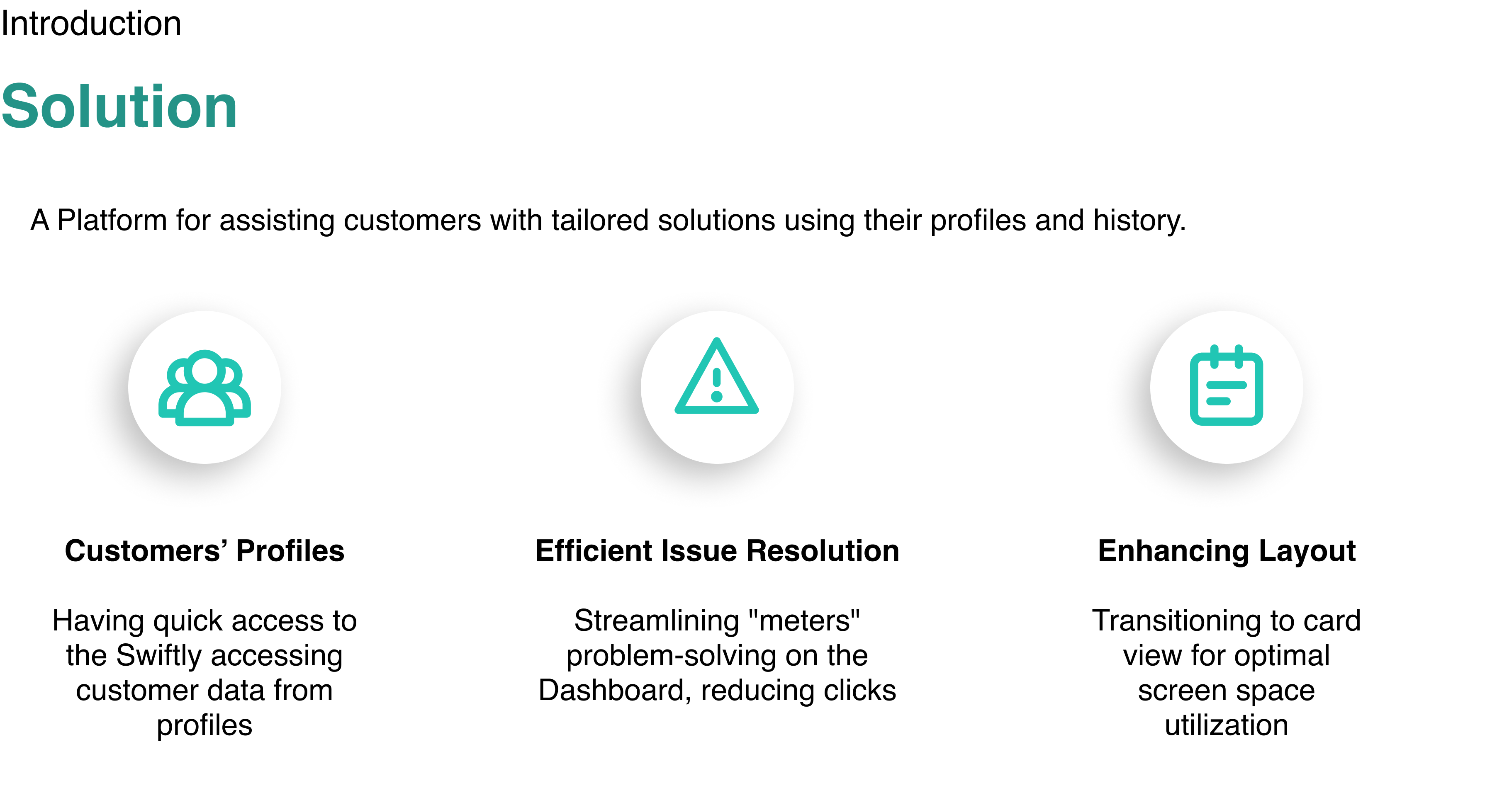
We were tasked to redesign the preexisting platform and improve it based on the new needs and trends in the market.
Task 1. Designing a smooth flow to simplify the assisting process.
Task 2. Applying user-friendly trends to create a pleasant experience.

Discover
Process


Discover


Define


Design


Deliver
Discover
Research Topic
What are the main pain points, and how do they affect their efficiency.


Discover
Methodology
Interviews
Engaged in 16+ interviews with users and stakeholders to grasp workflows, use cases, and operator needs.
Research Goals
- Streamlined "Central Page" access
- Analyzed operator-platform interaction during calls
- Prioritized Dashboard content
- Validated table view assumptions
16
Interviews with the users and stakeholders
Discover
Participant breakdown

Experience
3 - 18 years old
Role
- 5 Product Managers
- 5 Sales & Marketing Managers
- 4 Sale Representative
- 2 Testing Engineer
Countries
- 14 United States
- 2 United Kingdom
Company Size
100-1000
32 - 65 years old
Age
Discover
Sample Questions
We posed specific inquiries to comprehend the complex task and their platform expectations.
“Tell us about the needed information when a customer calls about the meter”
“Which task takes the most amount of time to complete when you want to follow up on a ticket?”
"What is the most vital information to track a problem in the user's profile."
Discover
Key Insights
Users are accustomed to tables but find it time-consuming to locate relevant information.
They desire more colors and less empty space in the interface.
Sales managers request dual views: cards and graphs.
Providers want to see Impluseable reads and service orders with Meter IDs during customer calls.
The previous text-based platform lacks visuals, prompting the need for visual enhancements.
Customers are distinguished by their addresses.
Efficiency in relating tickets to orders is sought.
Quick visibility of meter statuses is preferred.
Only current customer names are necessary for display.
Discover
Pain Points
- Locating associated tickets with orders is challenging.
- Inadequate information on the central page leads to tab navigation confusion.
- Horizontal tables require excessive scrolling.
- Meter table lacks essential information.
- Meter statuses lack visibility.
- Lack of graphs necessitates extra research for consumption comparison.

Define
Design Principle
User-Centric
Prioritize essential information on the main page.
Valuable
Deliver high utility aligned with user preferences.
Efficient
Ensure seamless flow for call clarity.
Engaging
Design elements evoke strong emotions.


Define
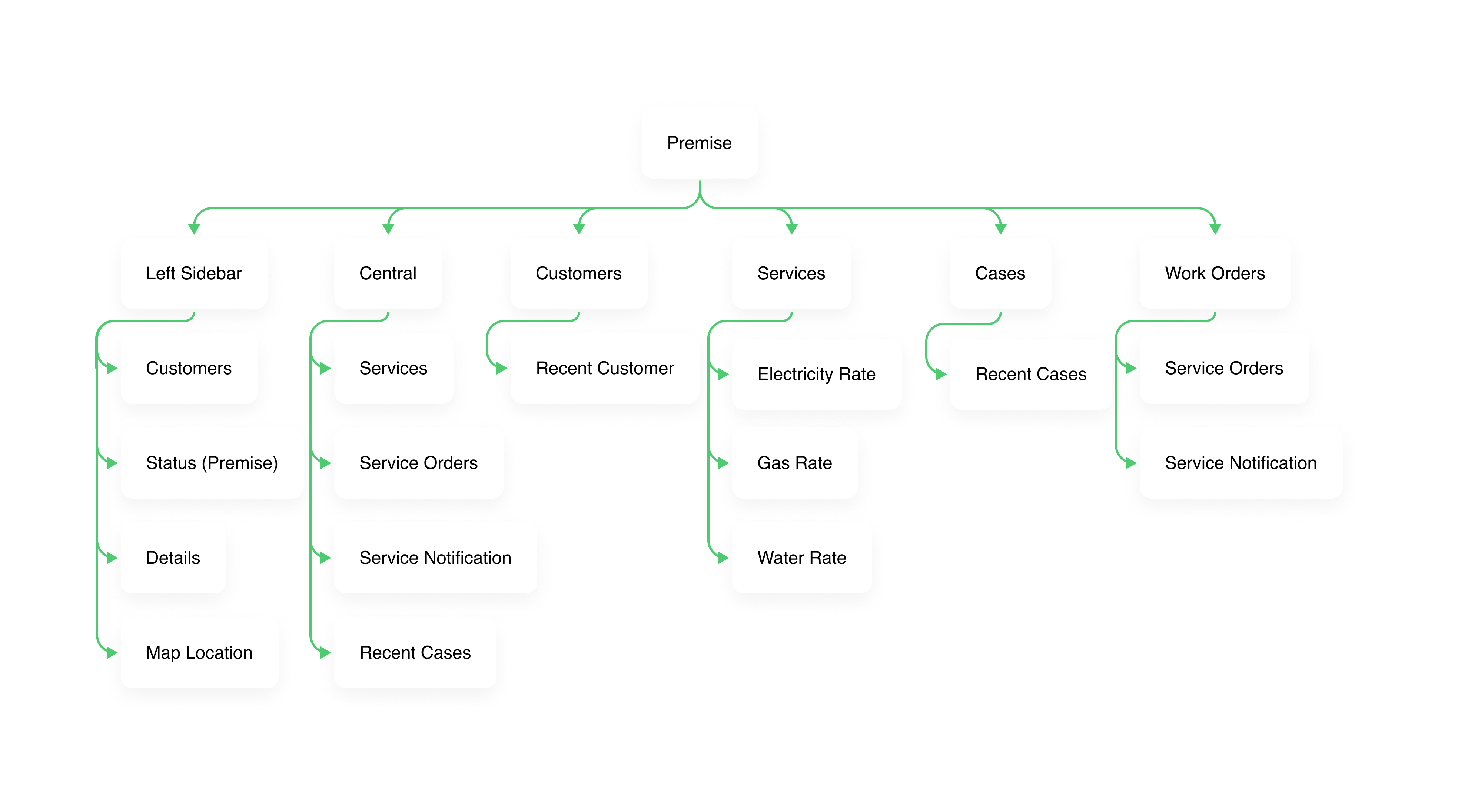
Information Architecture
Design
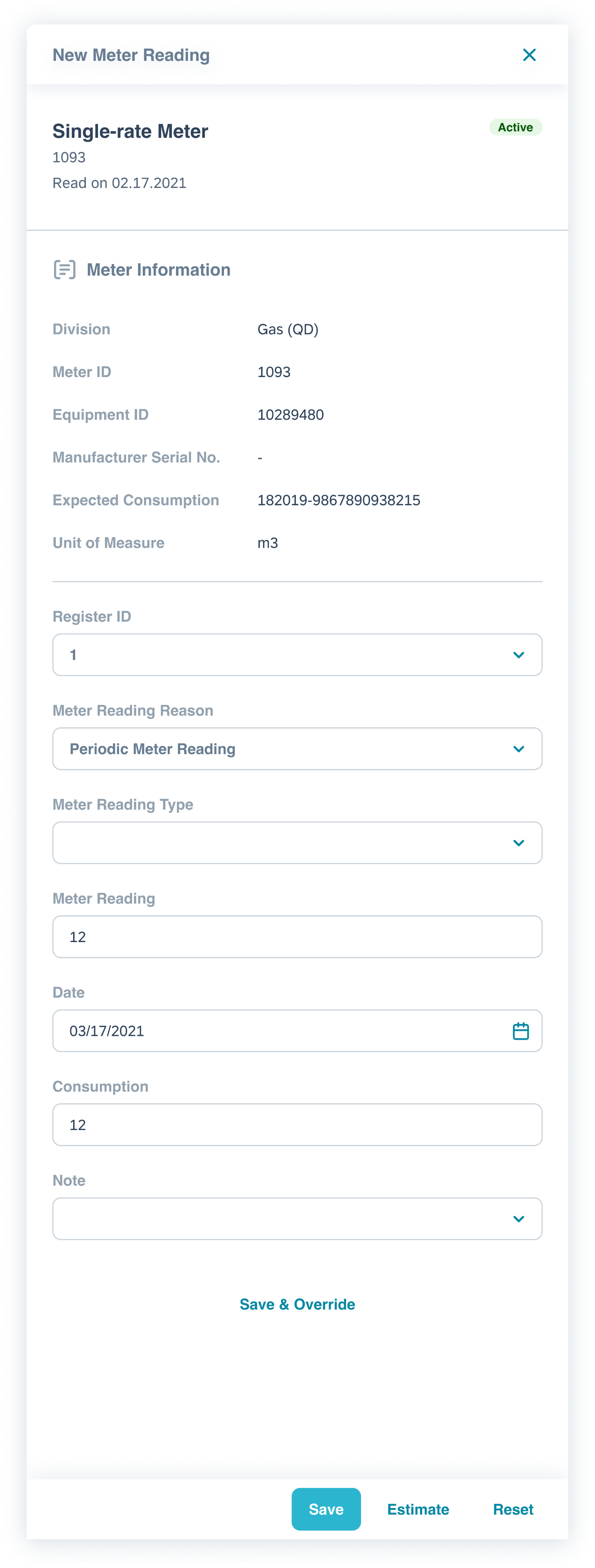
High Fidelity Design
At SAP, we adopt a rapid approach by directly creating HiFi screens to quickly validate our assumptions. In this project, following thorough research and aligning with users' needs and PMs' requirements, we developed high-fidelity pixel-perfect wireframes.
Central Dashboard
Time Efficiency
Within the Central Dashboard, users easily access pertinent customer information. Service cards streamline identifying errors and meter problems, optimizing time efficiency.
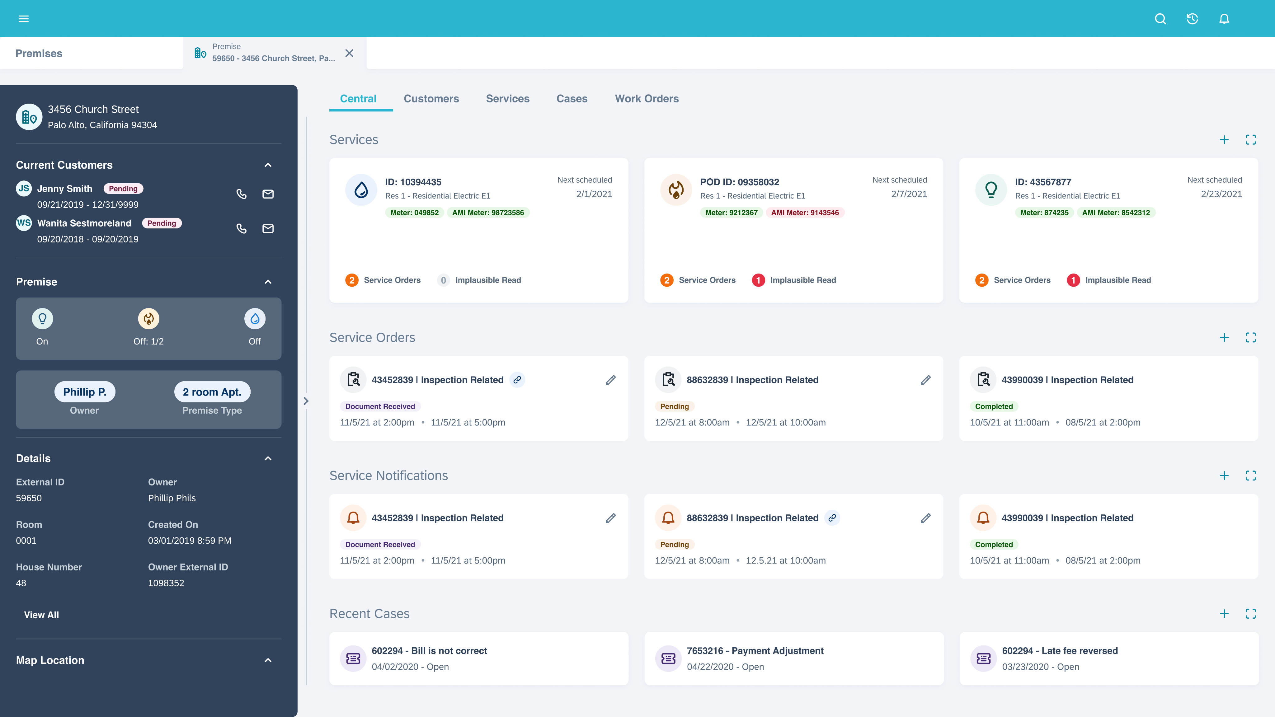
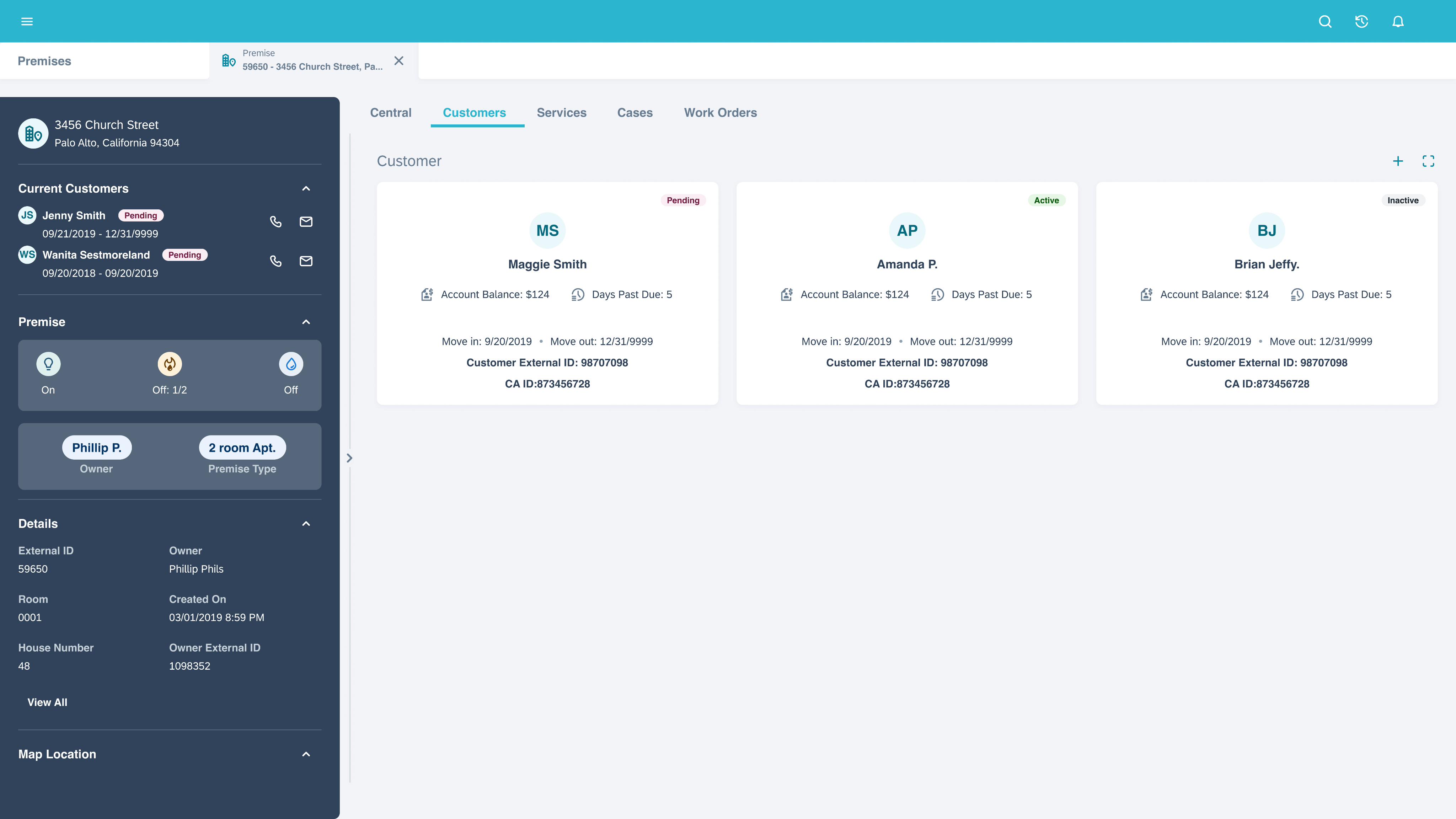
Customers
Multiple Access to the Same Info
For enhanced scalability, we've presented comprehensive customer details in a separate tab, accommodating larger customer volumes. The card information organization aligns with operator requirements, ensuring effective use.
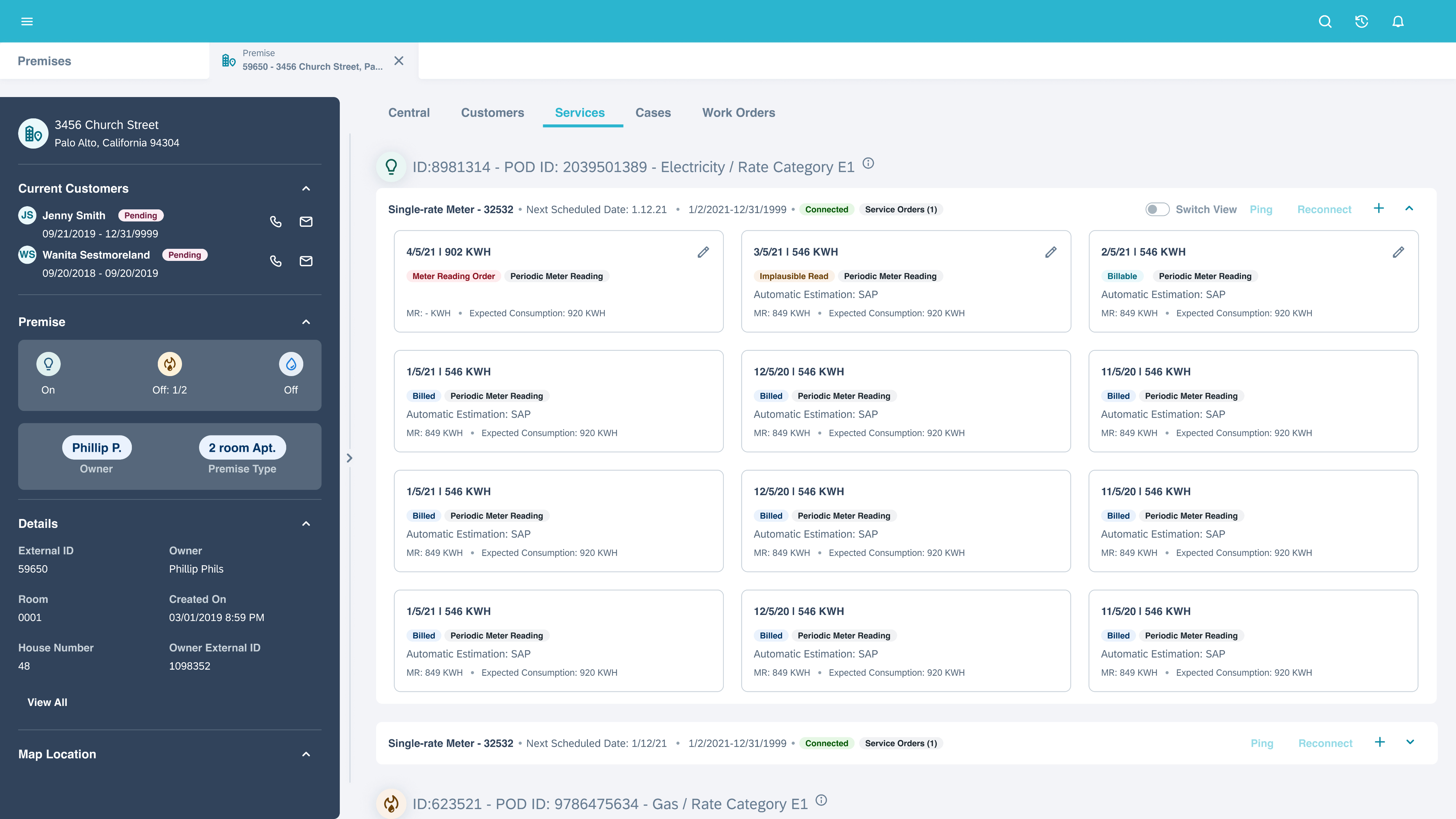
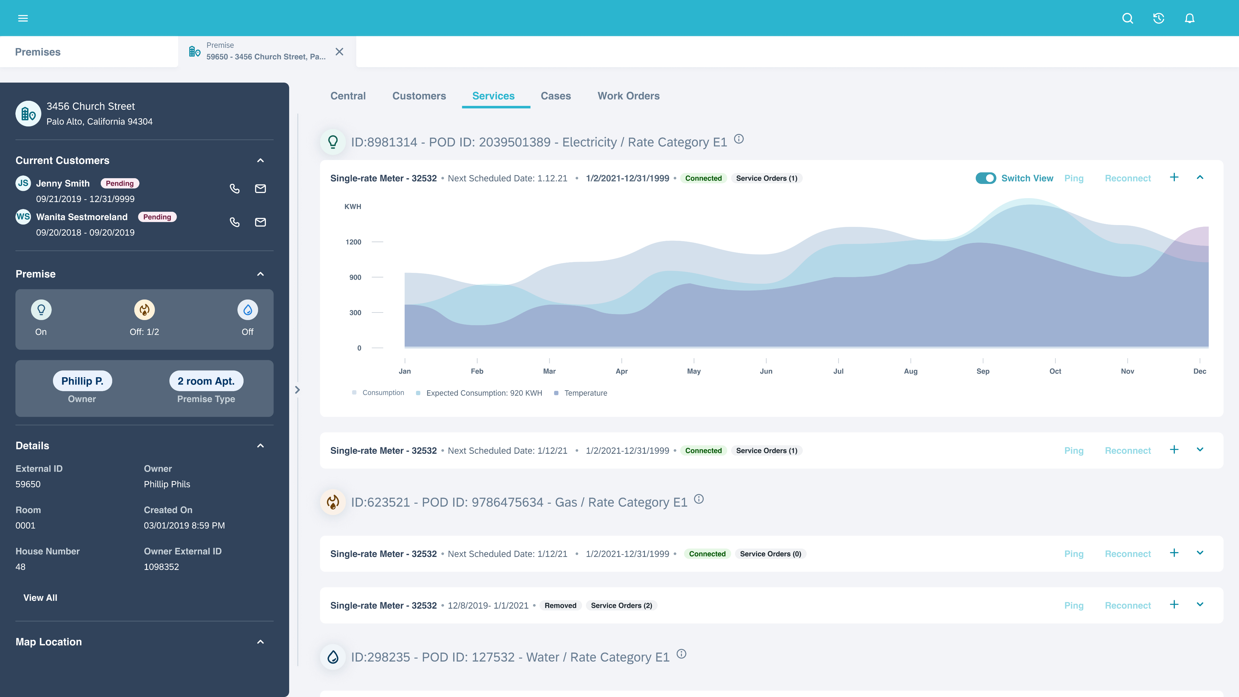
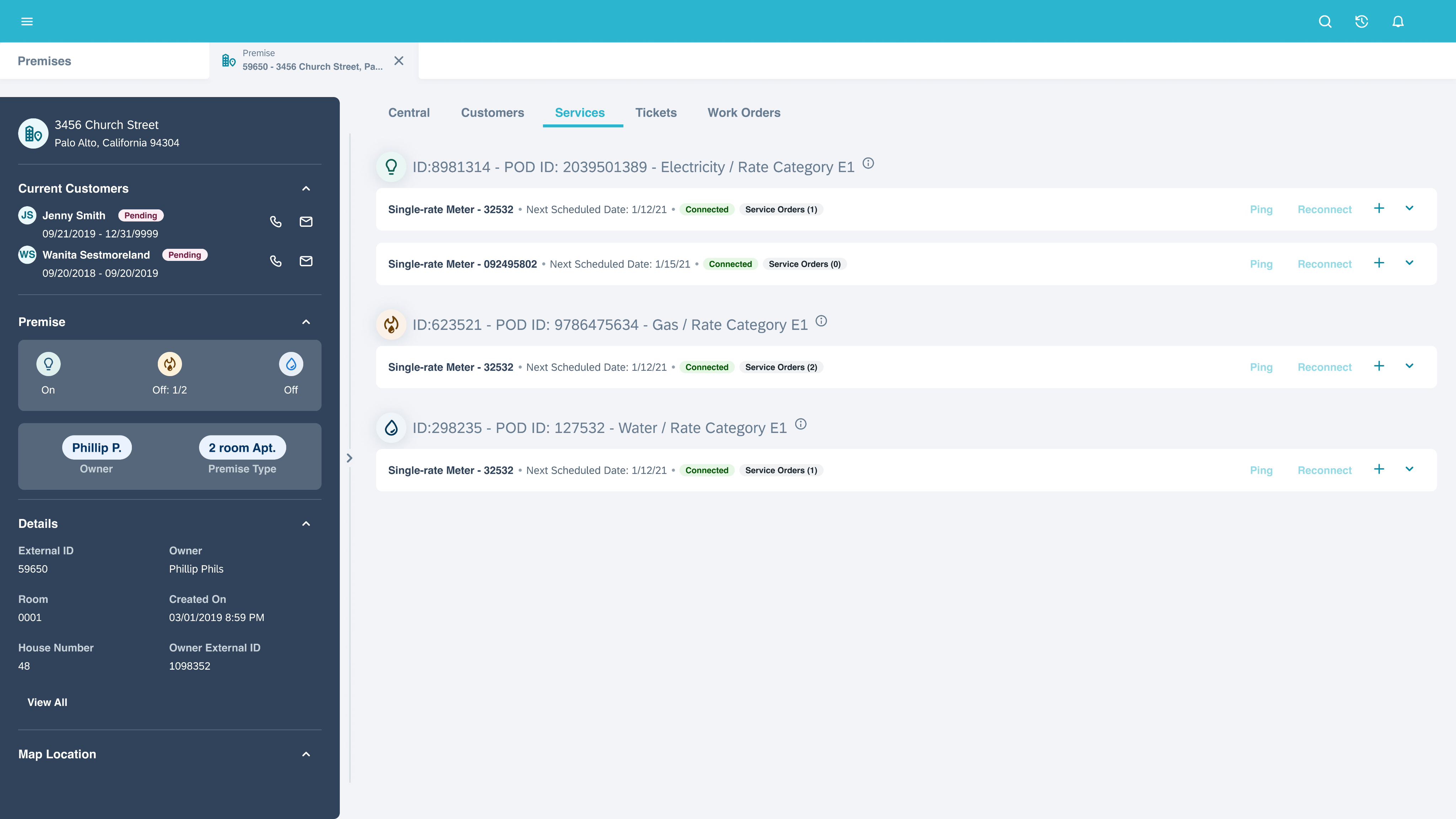
Services
Information Architecture
The Services tab posed scalability challenges as it required organizing layered information in cards. Transitioning from tables to cards introduced IA challenges, which we addressed by adopting a parent-child information structure.
Services
Switching view
Based on interview insights, operators expressed the need for both graph and card views to facilitate easy comparison of various factors.
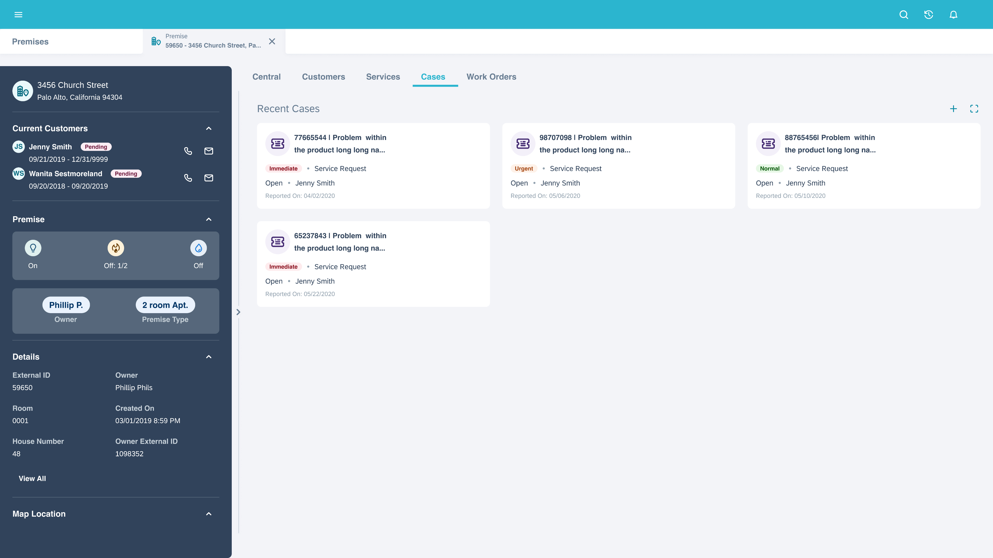
Cases
Scalable
Customer cases are structured within scalable cards to display pertinent information effectively.
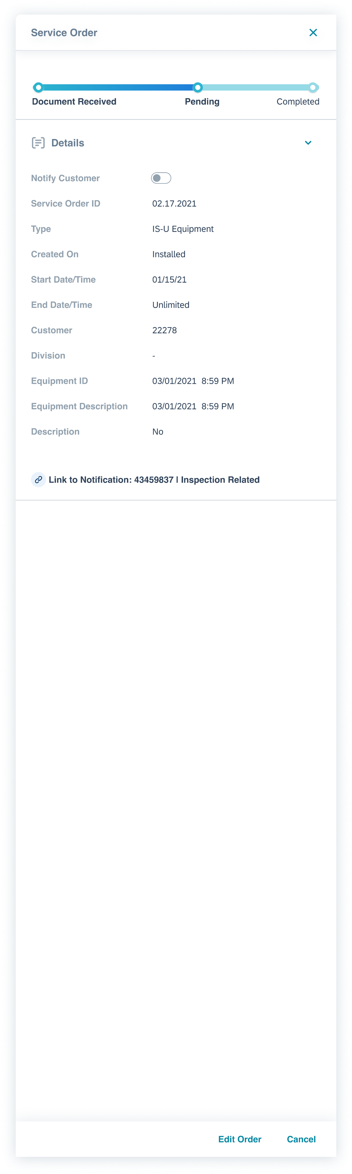
Work Orders
Clear Path
The primary objective of this page was to establish a distinct link between orders and notifications, eliminating any potential confusion between them.
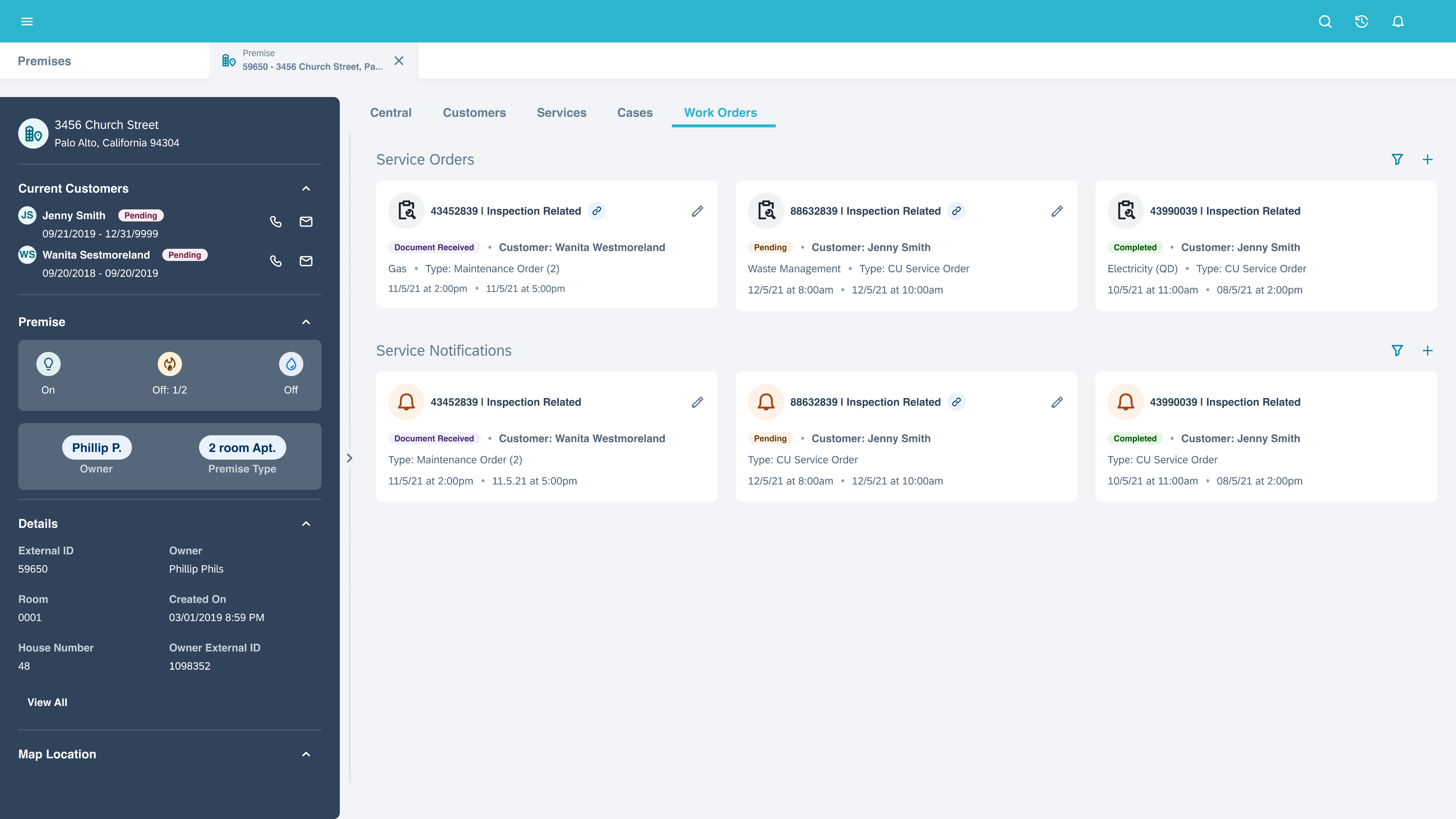


Optimizing the workflow and redesigning the UI decreased support call volume for this page by 44% over a six-month period.
Impact
