January 2024- Present
Patient Management
Redesigned a fragmented tool into a unified and reliable experience across cloud and desktop, by establishing systems, fostering a design-driven culture, and delivering measurable impact.
SaaS
Customisation
Micro FrontEnd
Project Overview

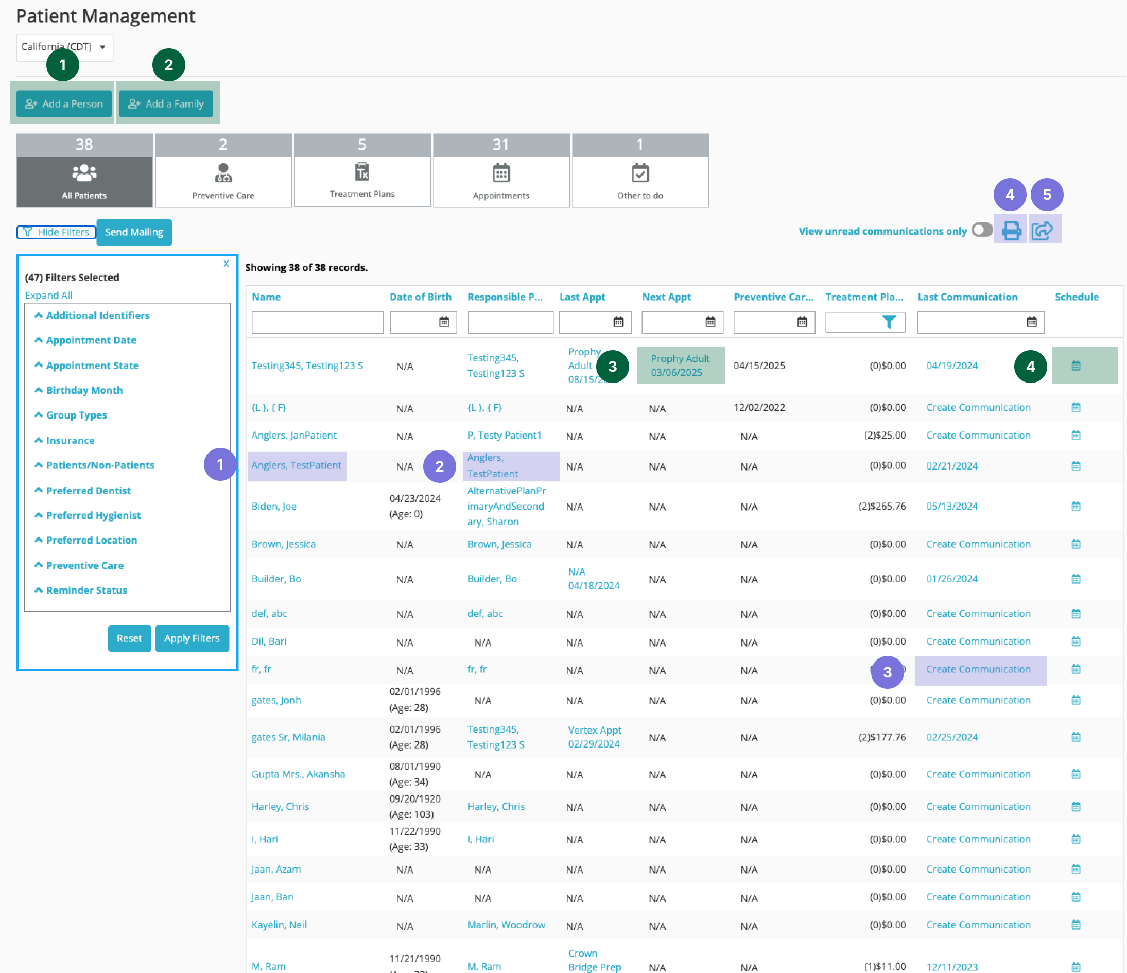
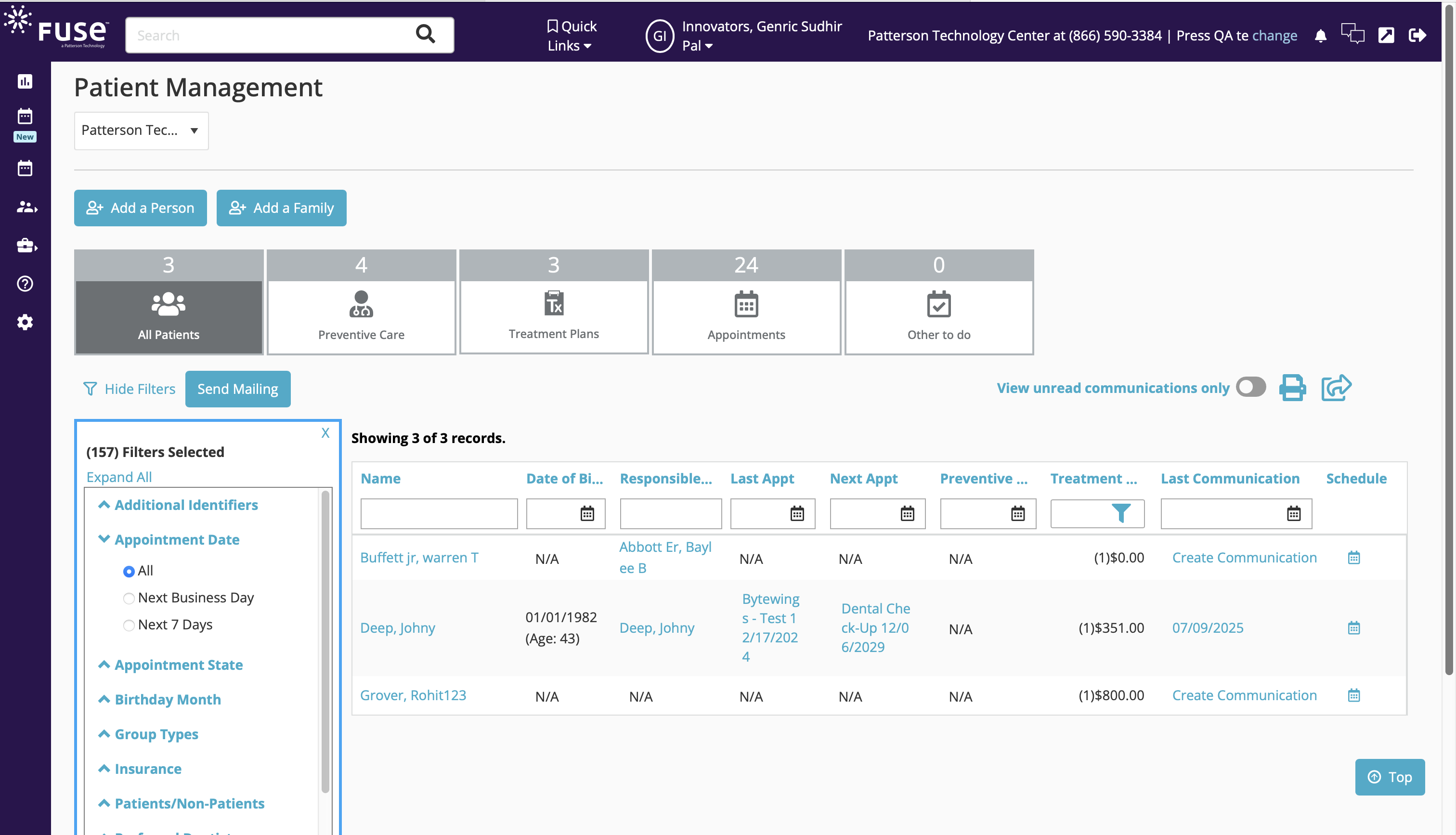
Patient Management
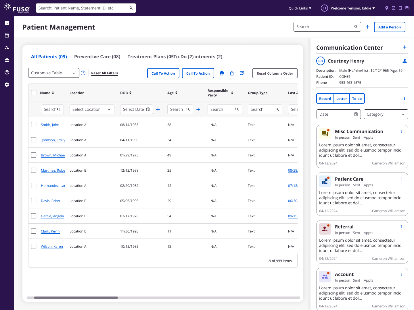
The Patient Management page allows users to view a comprehensive list of patients, displaying key information, treatment history, preventive care schedules, and appointment statuses.
The page includes filtering options and sorting capabilities, which allows users to further refine their selections.
My Role
- Lead designer for vision, strategy, execution
- Extended the approach into desktop products for ecosystem-wide consistency
- Designed and stablished the design system
- Facilitated workshops to align teams and introduce UX
- Advocated for backend changes critical to user trust
Problem Statement

Why it Mattered?
The Patient Management page(s) need to be updated to Angular, aligning with our MFE strategy. The current pages are confusing to users, riddled with bugs, and a steady source of customer impediments. The pages are also hindered by performance issues and limitations in both bringing back results and processing letters & postcards.
We need to simplify and improve the current UI/UX, and optimize the backend to make these pages more usable.
Challenges at the Start
Excessive Filter Parameters
The system exposed an extensive set of filter options, creating cognitive overload and reducing query efficiency.

Column Redundancy
Data tables contained multiple redundant columns per tab, resulting in noise and lowering information retrieval accuracy.
Inefficient Navigation
Key controllers were configured to open in new browser tabs, fragmenting the workflow and increasing task completion time.
Feature Utilization Gaps
FullStory analytics showed a significant portion of features had minimal adoption or were not usable, highlighting misalignment with user needs.
Enhancement Backlog as Research Baseline

Kickoff Insights
In the kickoff meeting, I realized that the trainers and the product manager had already compiled a long list of enhancements based on support calls and their expertise over the years.
This input was extremely valuable as a starting point for the research and helped guide us to dig deeper into the problems.
Evaluation

Tab Usage Analysis
In this project, we analyzed tab usage to identify features that unnecessarily required new tabs, a common source of user frustration. We mapped these controllers, questioned their necessity during usability testing, and validated which ones truly needed separate tab interactions.
Open new tabs | Amount: 5
Replace page content/ Open
modal windows | Amount: 4
Frequency of these clicks
Necessity of new tabs
User Validation
Potential to remove tab for #3
Assumptions of Necessity
<
<
<
3
2
1
4
5
Flow confusion
Direct users to the dashboard rather than the original page
2
Research Strategy
Interviews
The goal of this research was to evaluate the usability and effectiveness of the Patient Management tool. We focused on uncovering user pain points, identifying underutilized features, and gathering feedback on tab usage to inform potential improvements that could streamline workflows across different user roles.

Role
- Hygienist and Business Assistant (1)
- Instructor and Facilitator (1)
- Dentist (2)
- Practice Manager(1)
RESEARCH SETTINGS
5
Research Outcome

Key Insights from User Feedback

Pain Points (High Priority)
- Complex layout made the interface overwhelming.
- Unnecessary navigation to other pages when users need to stay on the current page.
- Multi-location management was limited and inefficient.
- Insurance verification process was time-consuming.
- Accessibility issues due to manual workflows.

Should-Have Features
- Simplified interface and streamlined workflows.
- Dedicated column for appointment notes.
- Better onboarding and training programs.

Joy Points
- Filter options supported different practice needs.
- Streamlined appointment management tab valued by smaller practices.

Should-Have Features
- Send Mailing Button and advanced filters were rarely used.
- Several reporting and insurance features underutilized.
Design

Cutomization for Smooth Experience
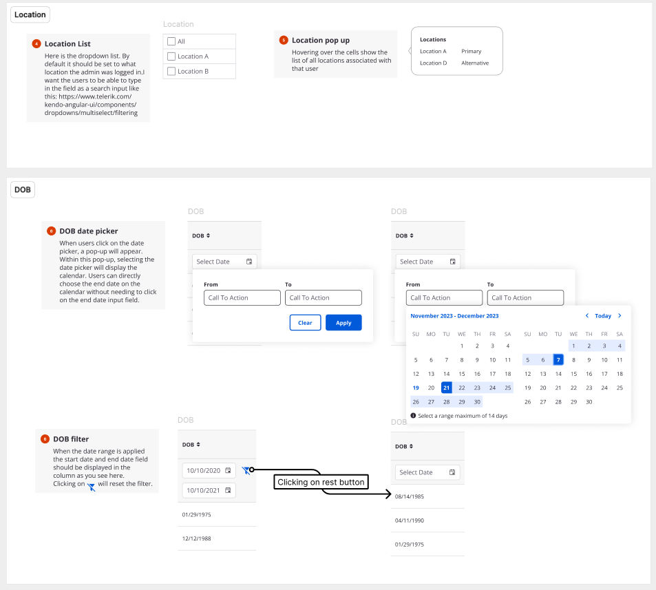
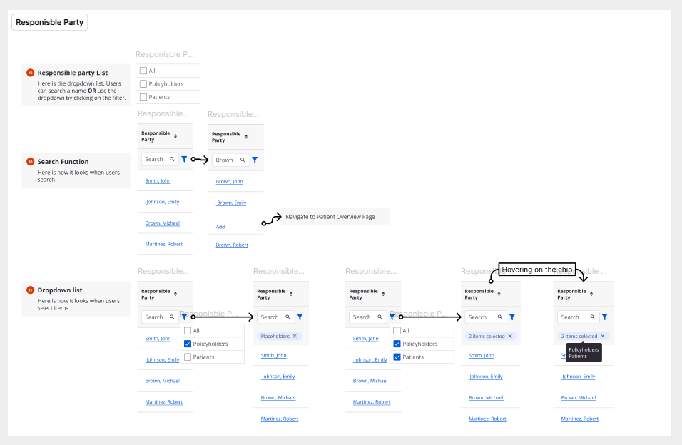
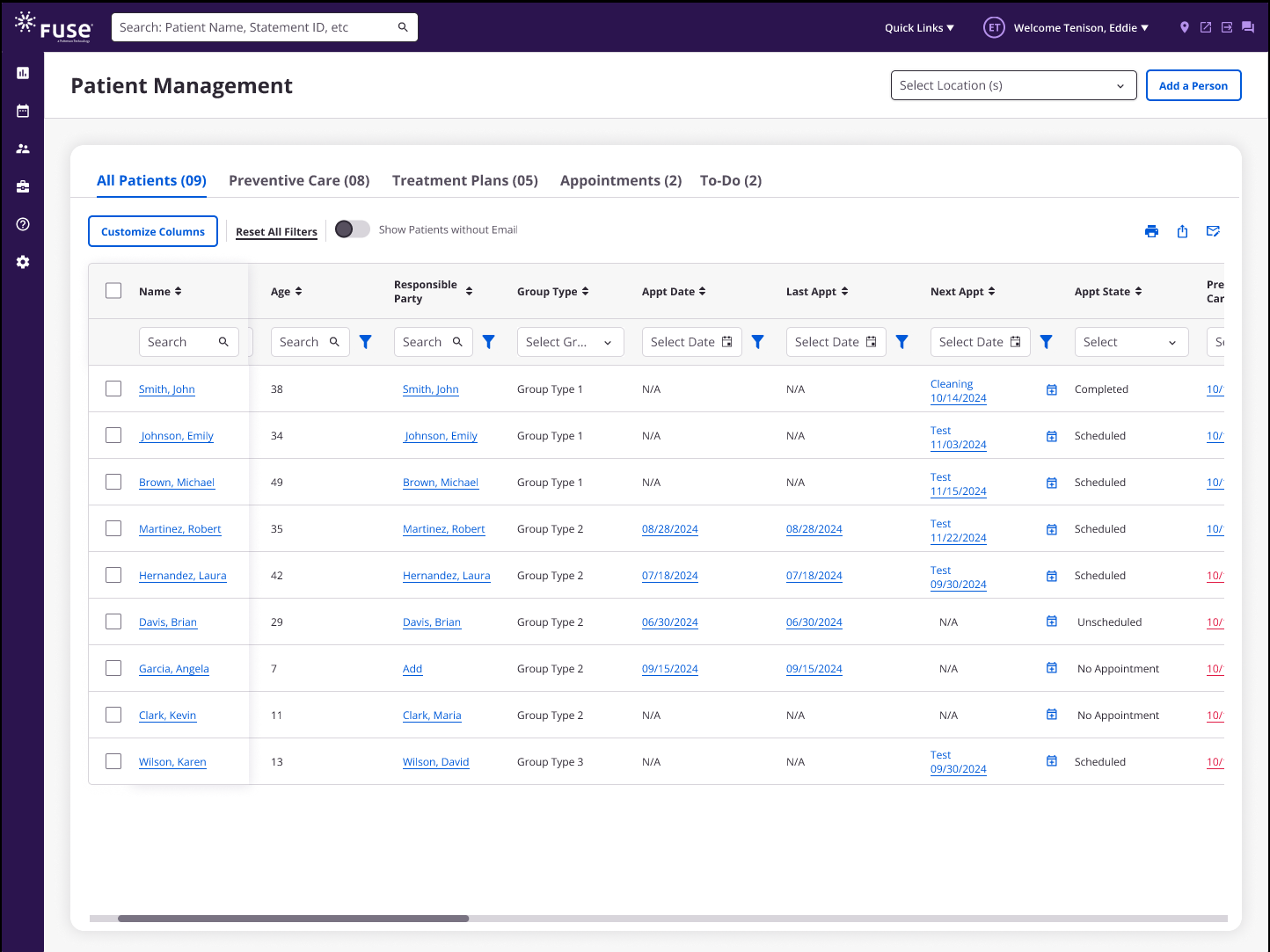
As part of the redesign, we introduced a new table component that did not exist in the Fuse design system. Because of the complexity of long tables, our goal was to make them easier to use, more customizable, and less overwhelming for users.
Key Improvements
1
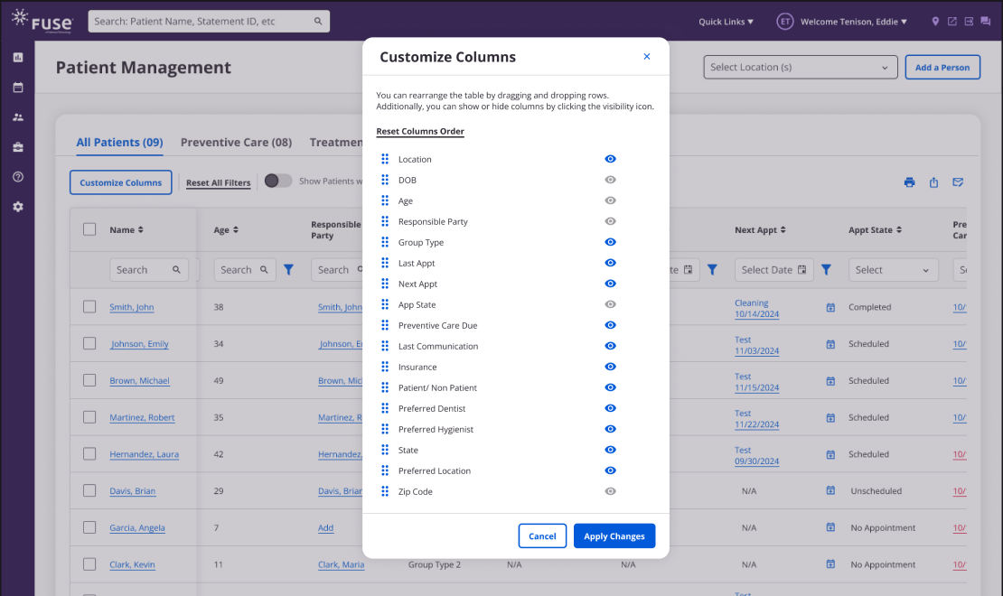
Customizable columns
Users could toggle columns on and off based on their needs.
2
Sticky patient name
Allowed all columns to remain visible while keeping context the patient names sticky.
3
Embedded column filters
Made filtering more intuitive and efficient.
4
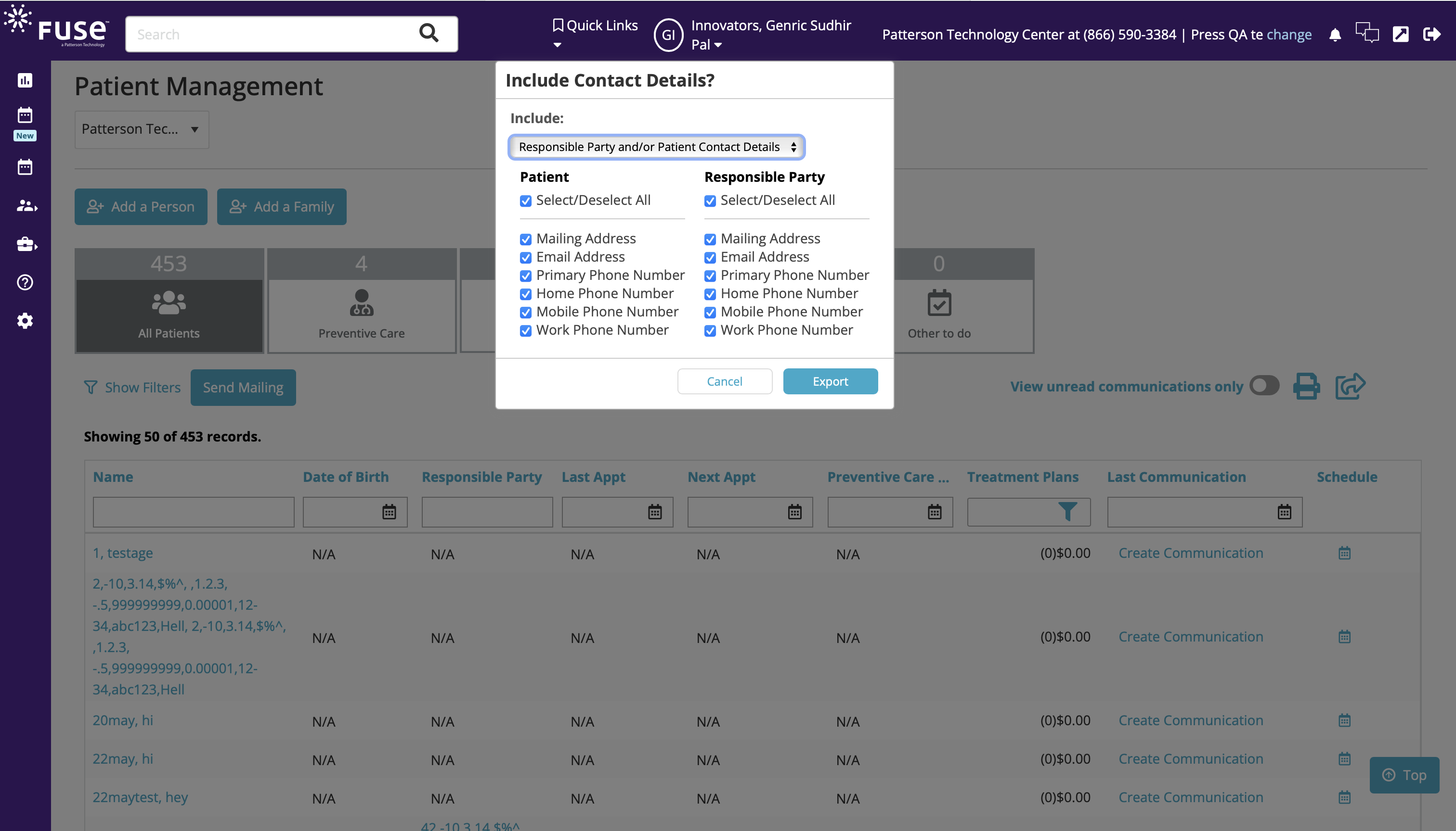
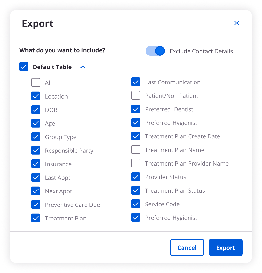
Customizable print & export
Users could choose which columns to include in the print and export view.
Design

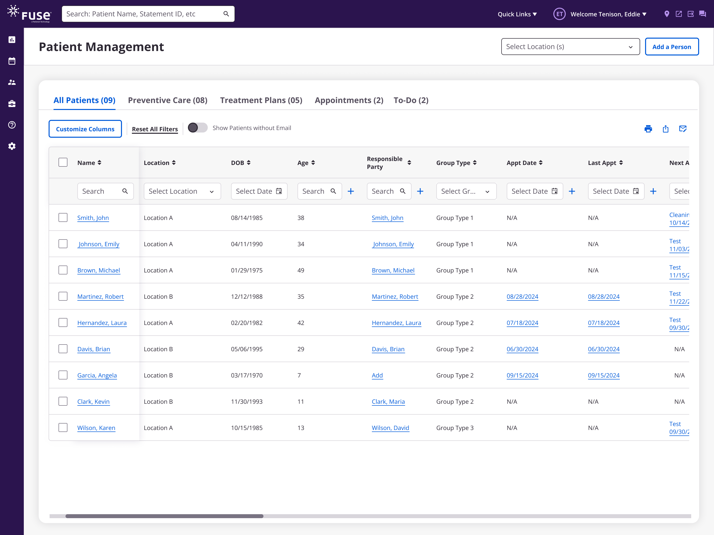
Final Design

Before

After
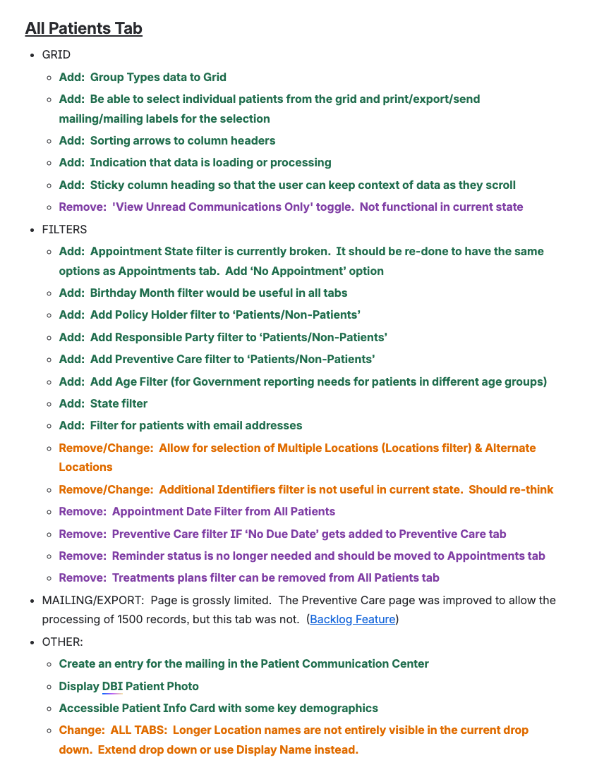
All Patients Tab
Send Mailing
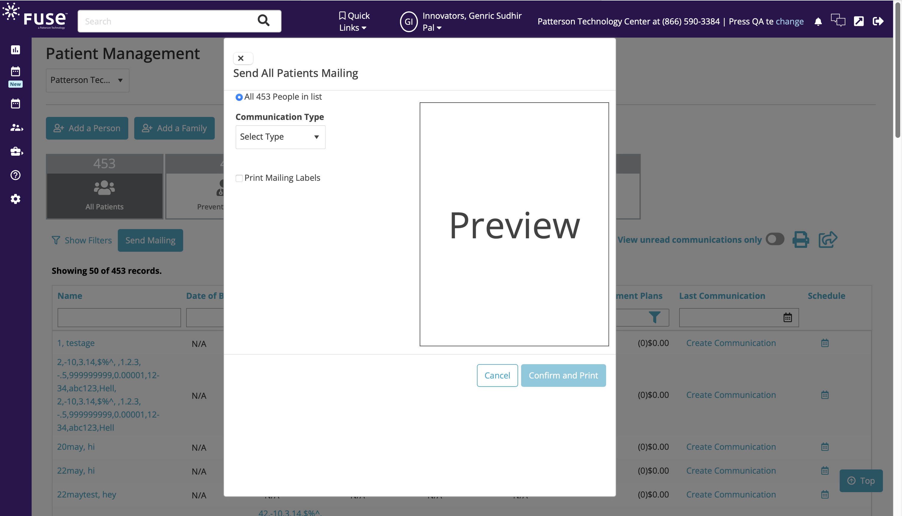
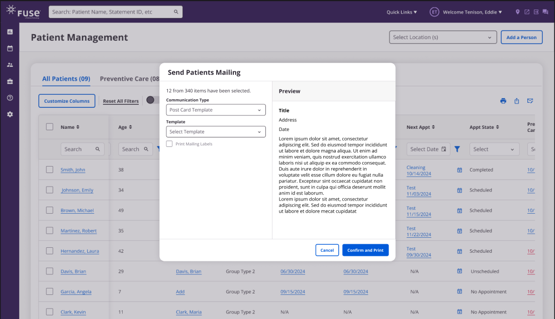
Export
Navigation Improvement
Customizable Table
Design
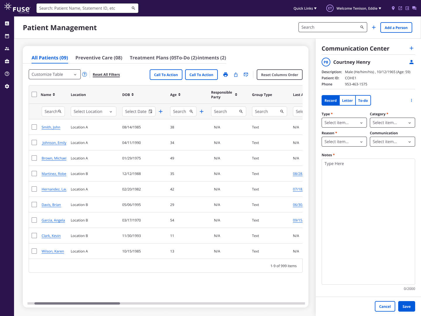
Optimizing Navigation
Reducing Tabs
To optimize navigation and reduce frustration, we replaced unnecessary new-tab interactions with a drawer component. This allowed users to stay on the same page, keep their context, and complete tasks more efficiently.
Key Improvements
Introduced drawer navigation
- Replaced the need to open separate tabs.
Maintained background visibility
- Users could see the main page while working in the drawer.
Streamlined task flow
- Reduced context switching and improved efficiency.

Post Redesign User Feedback
Users rated the updated Patient Management interface positively, with an average score of 4.67 out of 5. They especially appreciated the cleaner design and the ability to customize tables in real time.
Handoff Documents

Handoffs & Dev Alignmnet
Since this was the first implementation of a highly customizable table component, the design handoff was delivered with detailed specifications to cover all interaction states, edge cases, and behavioral rules. To ensure full alignment, I conducted a walkthrough of the documentation with the development team, clarifying design decisions and expected behaviors.