January 2024- Present
Redesigning
Patterson’s
Cross- product
Imaging Workflow
Redesigned a fragmented tool into a unified and reliable experience across cloud and desktop, by establishing systems, fostering a design-driven culture, and delivering measurable impact.
SaaS
AI-powered Image Classification
Design System
Project Overview

Patterson Company’s Imaging
Imaging is one of the most critical workflows in dental and orthodontic practices. Providers rely on it daily for diagnostics and treatment planning, yet Patterson’s imaging products (Blue and Fuse cloud, later Dolphin Desktop) had grown without UX foundations.
My Role
- Lead designer for vision, strategy, execution
- Extended the approach into desktop products for ecosystem-wide consistency
- Designed and stablished the design system
- Facilitated workshops to align teams and introduce UX
- Advocated for backend changes critical to user trust
Team
- UX Designer I
- Product Manager
- Product Owner
- Engineering Lead
- Front-End Engineer
- Trainers
- Clinical Advisors
Problem & Strategic Importance

Why it Mattered?
Providers were losing valuable chair time and confidence as imaging workflows slowed them down. Patterson faced real competitive risk in a high stakes market, and this release became a flagship opportunity to unify the imaging ecosystem and rebuild trust, clinically and commercially.
Challenges at the Start
No prior UX partnership
Decisions were developer-led or outsourced, with no consistent discovery, validation, or decision log.

Undefined problem framing
PM brief was broad and unprioritized, no strategy, success metrics, or scope guardrails.
Fuse iframe constraint
Smaller viewport, nested scrolling, and some performance overhead.
No imaging design system
No shared tokens or components; inconsistent UI, brand drift, and misalignment with Fuse web-app.
Establishing UX Process

Product Design 0-100
Since the Blue team had never worked with in‑house UX, I started by running a hands‑on workshop to walk everyone through our research, design, and validation process and show how each step informs development. After that, I instituted weekly design reviews and research readouts so the PM, PO, and engineers could see prototypes, discuss findings, and translate them into technical work together.
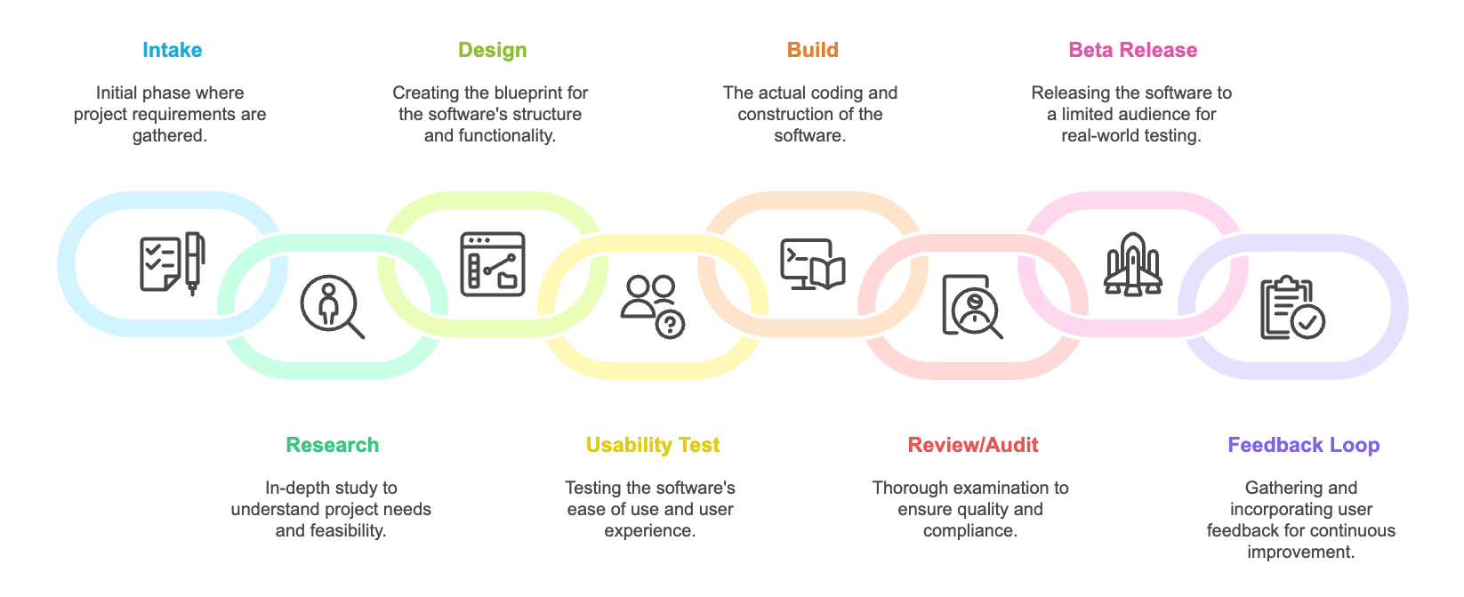
Story Mapping Workshops

Workshop Time
To move the team forward, I initiated and facilitated 3 story-mapping sessions that brought cross-functional stakeholders together. Through this process, I led the team in defining 9 distinct user journeys, some of which are highlighted here as representative examples.We mapped:
- The existing workflows
- Defined the "Happy Path"
- Outlined the ideal future flow
Research Strategy

Methods & Takeaways
To uncover challenges across both Fuse and Blue, I applied three complementary methods, each addressing different blind spots.

Usability Testing (6 participants)
Six sessions with dentists, orthodontists, and a treatment coordinator to observe real task performance. Chosen to reveal friction in everyday workflows.
Takeaway: Even when tasks felt “easy,” many took minutes or required workarounds, hidden usability gaps.

Interviews (5 participants)
Follow-ups to broaden perspective and uncover role-specific needs.
Takeaway: Dentists vs. orthodontists value different outcomes → favor role-based customization.

Heuristic Evaluation
Structured UX audit to catch issues users might not voice.
Takeaway: Some problems never surfaced in sessions → prioritize systematic cleanup, not just feature tweaks.
Research Insights

User Pain points
After a thorough analysis and tagging of all 75 pain points, joy points and user requests in Userbit, I synthesized the findings into five major themes. These key insights drawn from all research methods became the foundation of our redesign strategy.
Capture Genie was overly complex
Redundant options added steps and decision fatigue.
Images were too small / low-res
Hard to analyze detail; orthodontists needed richer, persistent annotation tools.
Too many manual adjustments
Frequent cropping, flipping, resizing, and slot placement created friction.
Comparing across tabs was difficult
Diagnosis slowed; orthodontists needed to save comparison sets for future reference.
Horizontal timepoints & complex toolbar
Excessive scrolling and unintuitive controls slowed clinicians.
12
Users
17
Notes
15
Interviews
30
Insights
133
Tags
206
Highlights
Userbit Environment
User Persona

Two Main User Personas

Profile
Age: 49
Education: Doctor of Dental Surgery (DDS) ·
Experience: 12 years
Location: 1 Suburban practice
User Group
Dentists
Dental Hygienists
Bio
Sarah is a dedicated general dentist focused on preventive care, diagnostics, and restorative treatments. She values efficiency and clarity in imaging because they directly affect quick diagnosis and patient communication.
Goals
- Deliver accurate diagnoses and clear treatment plans.
- Educate patients using clear before/after imaging.
- Minimize time spent troubleshooting software.
Pain Points
- Upload process is often confusing and time-consuming.
- Small thumbnails and unclear labels make analysis harder.
- Manual image adjustments eat into chair time.
“Imaging should feel invisible, I just want to capture, compare, and move on with patient care.”
Dr. Sarah Lee, DDS • General Dentist

Profile
Age: 49
Education: Doctor of Dental Surgery (DDS) ·
Experience: 12 years
Location: 1 Suburban practice
User Group
Orthodontists
Clinical Assistants
Bio
Mark treats patients over multi-year journeys with braces and aligners. Imaging is central to his work: he compares timepoints to track gradual change. With multiple assistants, the tool must be reliable and easy for the team to use.
Goals
- Track and compare images across multiple timepoints.
- Use images as a communication tool with patients and families.
- Ensure assistants can capture images without error.
Pain Points
- Old workflows required opening multiple tabs to compare progress.
- Horizontal scrolling was inefficient and distracting.
- Calibration tools were unintuitive and slowed documentation.
“When comparing years of progress, I need clarity at a glance, not clicks and confusion.”
Dr. Mark Johnson, DMD • Orthodontist
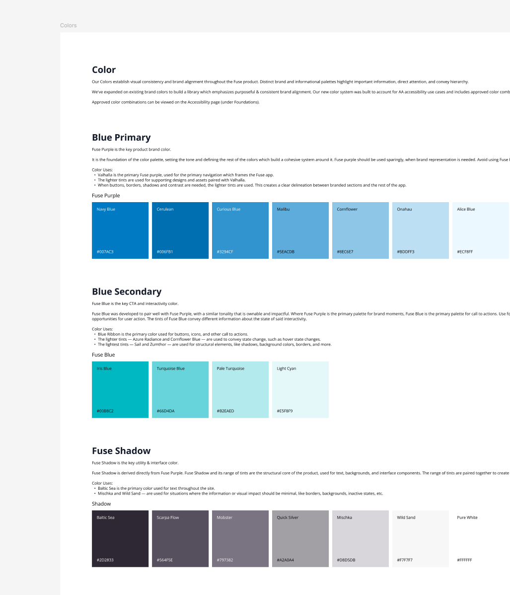
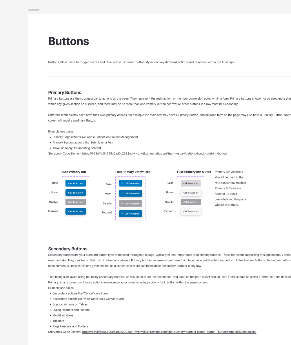
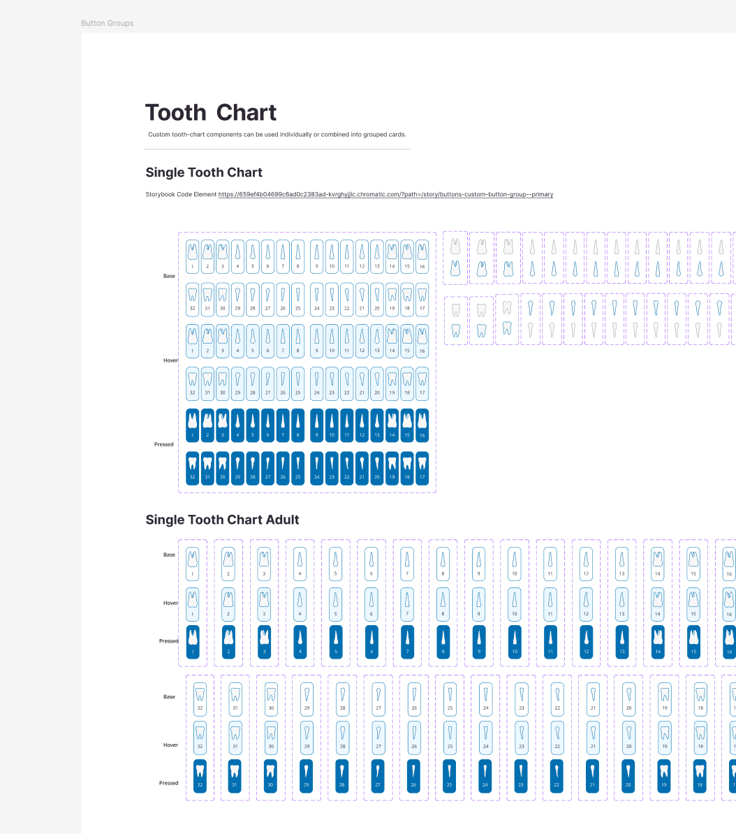
Design System

Creating Patterson’s Imaging Identity
Blue and Dolphin had no design system. I built the first imaging design system, inspired by Fuse but tailored for imaging needs.
- Unified identity: Different products, one Patterson look and feel.
- Custom components: Built specifically for imaging workflows.
- Scalability: Designed for both cloud and desktop products.
Design

Trade-offs: Backend vs. Frontend
Initial Scope: Build a new frontend on top of the existing backend.
Discovery: Some of the deepest user frustrations were baked into backend workflows.
Leadership Decision: I demonstrated that releasing without backend changes would erode provider trust. Using evidence from research, I persuaded product and engineering to expand the scope and adjust timelines, accepting a beta delay to safeguard long-term adoption.
Result: A cohesive product that providers could trust and proof that UX leadership drives strategic trade-offs, not just UI polish.
Overall Design Challenges
1
Layout Complexity
Layouts with up to 16 images clashed with clinicians’ need for larger, clearer views.
2
Iframe limits
The app was imbedded in an iframe, resulting in a constrained viewport and difficult resizing.
3
Right drawer space
Fuse’s right drawer consumed significant workspace; Blue’s was narrower but still restrictive.
Design

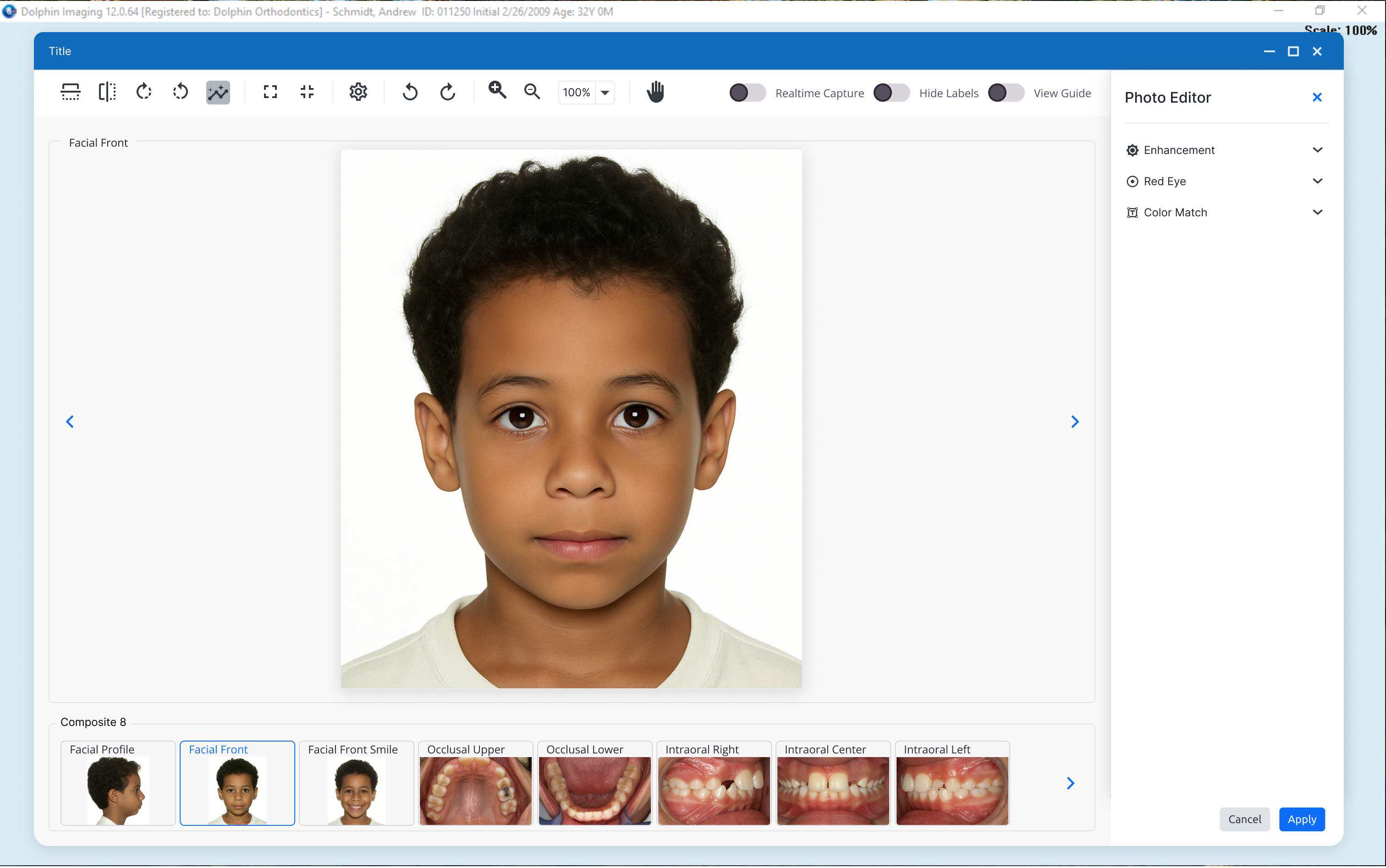
Iteration 1 | Image View Screen
In the first iteration, I compacted the tools to create more space for images.
User Feedback
- Images should follow dental standard layouts
- The timeline was rarely used in practice
Survey
- Ran a survey after interview and 82% said the timeline was distracting and not part of their workflow.
Impact
- Removed the timeline → +30–35% workspace in Fuse
- Delivered a responsive design to accommodate the expanded drawer
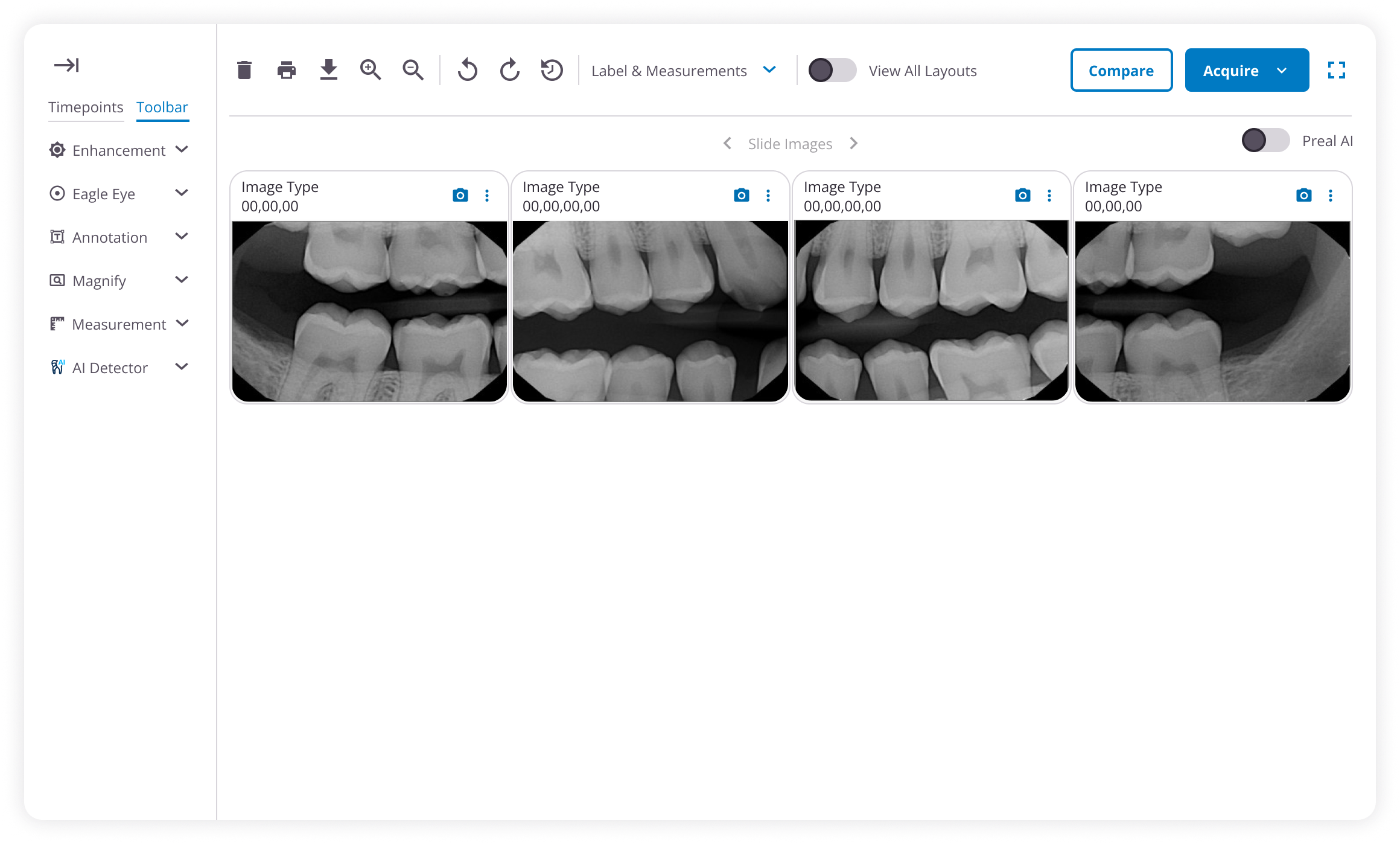
Iteration 2 | Image View Screen
Created a solid canvas for images by moving the tools to a dedicated top bar.
Feedback
- Toolbar features are on-demand and used infrequently.
- Toolbar dropdowns must never cover the images.
Impact
- Merge the top toolbar with timepoints into an on-demand control; show tool dropdowns in a side panel.
- Timepoints expand by default; open toolbar on double-clicking the image.
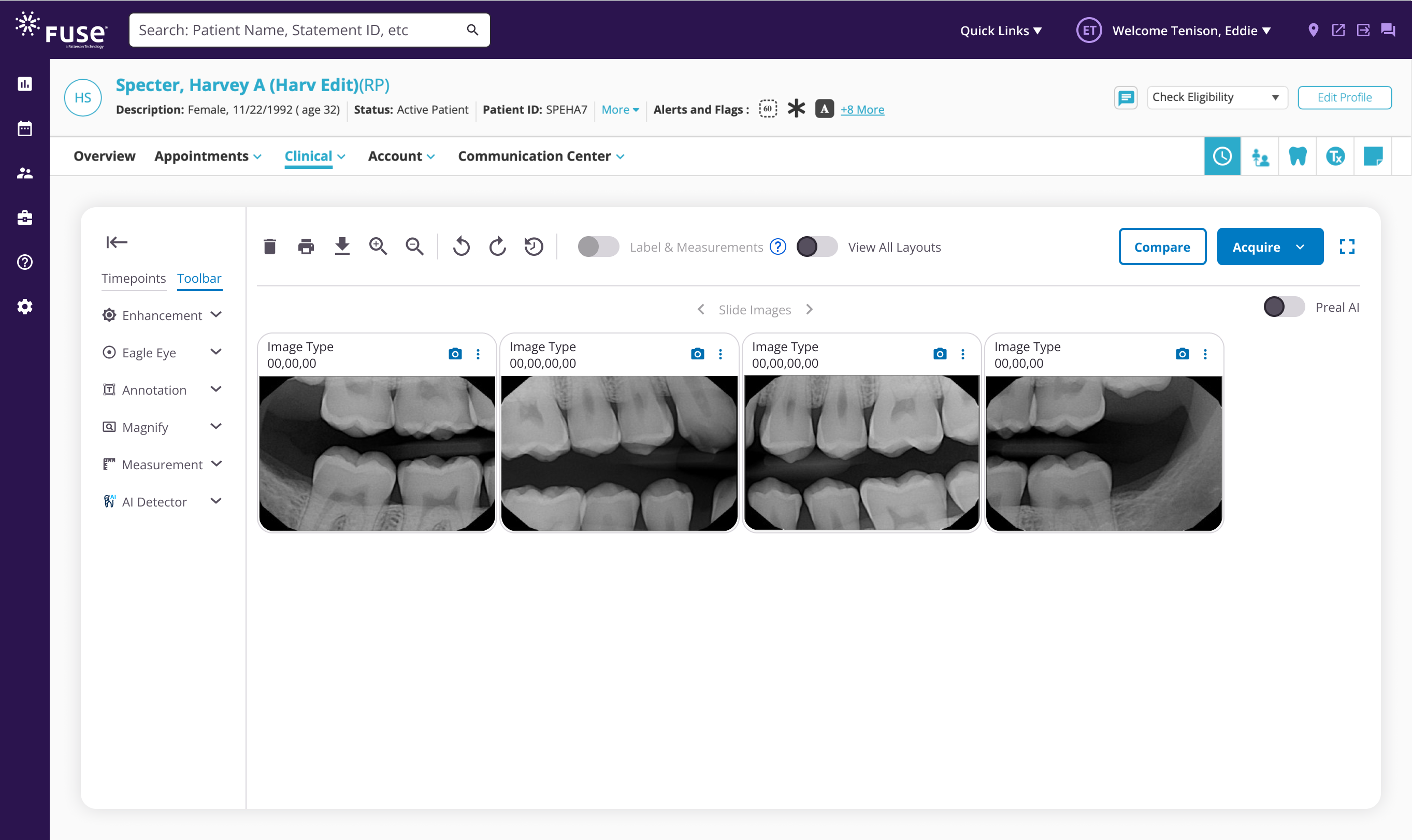
Final Outcome | Key Flows
Capture Genie

Before
Pain Point #1
- Capture Genie workflow is complex
- Requires many unnecessary clicks

After
Improvements
- Simplified progress bar to two steps to save more space
- Streamlined workflow with quick access buttons
- Removed redundant information
- Added search functionality
Image Adjustments
Before
Pain Point #1
- Images need to be manually adjusted
- Placing images on the correct slot is
After
Improvements | AI Assistant
- AI auto-crops, resizes, and slots images into the correct template positions.
- Works on upload and during real-time capture with no user intervention.
Image Visibility
Before
Pain Point #3
- Image resolution is too low for detailed analysis.
After
Improvements
Enable multiple options for image enlargement:
- Double-click to resize images within the default view.
- Implement infinite zoom functionality for detailed exploration.
- Allow individual images to be viewed in full-screen mode.
Comparing Images
Before
Pain Point #3
- Comparing images across tabs is super complicated
After
Improvements
Enable multiple options for image enlargement:
- Double-click to resize images within the default view.
- Implement infinite zoom functionality for detailed exploration.
- Allow individual images to be viewed in full-screen mode.
Final Usability Test

Feedback from Users and Internal Stakeholders
After designing the final screens, I conducted another round of usability testing with three users including both Blue and Fuse users and one trianer.
“
Image Resolution
This is incredibly useful for educating users. It makes my job so much easier, and I couldn’t be happier with the AI feature.
— Dr. Melinda Rosen
“
UI Improvement
“I like the new look, it feels very clean and fresh.” — Trish Fisher, TA
“
Vertical Timepoints
“I’m glad that the time points got implemented this way on the screen.” — Dr. Lowder”
“
Comparing Images
“You know the comparing tool is one of the things that I really stressed for to begin with. So I’m glad that that got designed it.” — Dr. Petoskey”
Handoff Documents

Handoffs & Dev Alignmnet
Aligned with designers, product team, and developers before moving to handoff.
Prepared detailed handoff documentation for the dev team and walked them through the document to ensure a shared understanding of all design details.
Impact & Scalability

Impact Validation with Early Adopters
Through FullStory we confirmed the impact with two large early-adopter clinics in Chicago, one general dentistry and one orthodontics, each handling ~150 patient encounters per day.
Capture Genie (AI auto-slot + crop)
- −80% manual edits; ~30s saved/set
- 95% confidence in auto-placement
Comparing Images
- 57% faster (35s → 15s)
Business value
- $18k–$37k/yr per provider clinic
Overall Metrics
- Rage clicks −68%, upload abandonment 12% → 5%
- Methods: Click Maps (rage/dead), Funnels (upload completion), Metrics (time-between-events)
Outreach

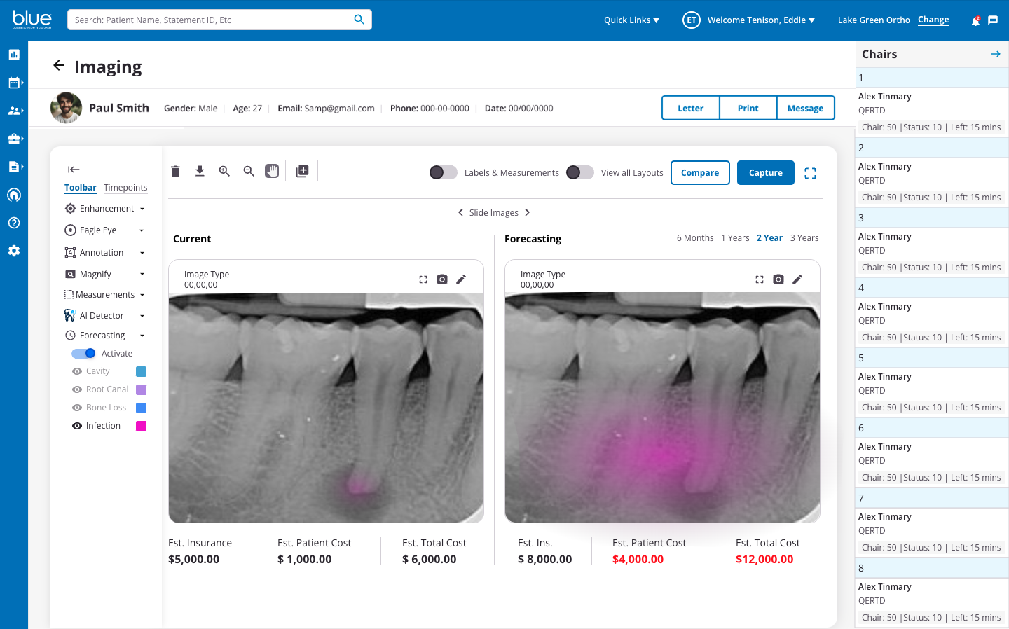
Hackathon Win – AI Future Prediction
Led a team to win two company hackathon prizes with an AI tool that visualizes disease progression at 6 months, 1 year, 2 years, and 3 years, plus projected treatment costs.
Impact
- Improves patient trust and treatment acceptance
- Reduces hesitation driven by cost and low awareness
- No comparable predictive visualizations in market today
- Post-GA plan: refine and scale as a differentiating feature
What’s Next
The success of this strategy led to my assignment on Dolphin Imaging, one of Patterson’s core desktop products.
- Cloud Imaging: Currently under adjustment after beta release. Based on early feedback, devs are refining some snippets to prepare for general availability.
- Dolphin Imaging (Desktop): Still in the design phase, where I am applying the same strategic approach to ensure a consistent experience across all platforms.