Role I cooperated with developers and UI designers to establish UX designers' guidelines. I was responsible for checking the accessibility of the components based on the principles. Duration(2 months)ToolsFigma, Axe DevTools
Accessibility 11 | 2018


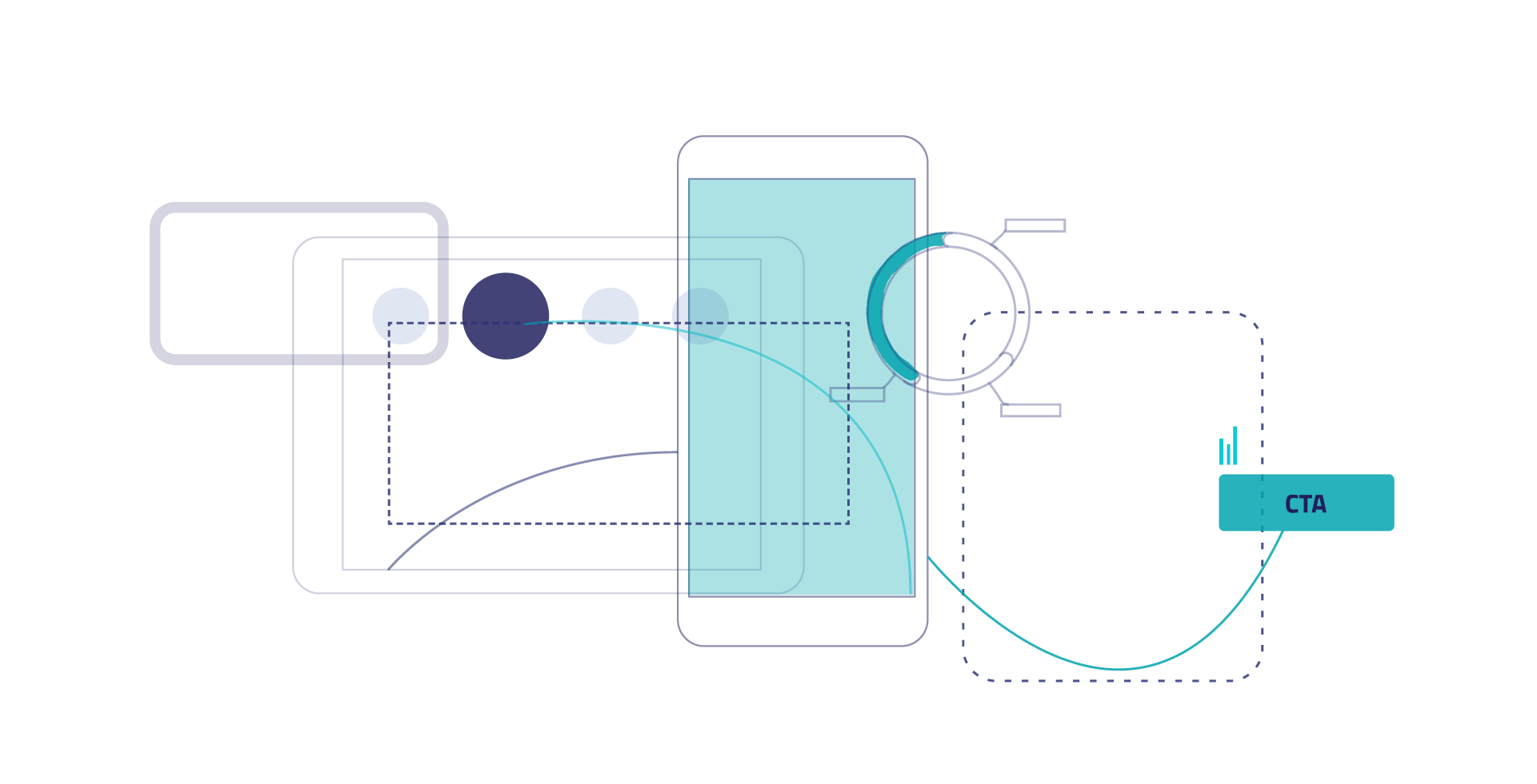
Introduction
Overview
Since we were working with hospitals and clinics, accessibility was critical. As the design lead, I defined the accessibility criteria for all components, grounded in established accessibility principles. To ensure alignment, my team and I created a guideline that translated these principles into practical guidance for designers and developers, making assessment and implementation clear and actionable.
Introduction
Tasks
Task 1: Create a reference guide that explains accessibility principles in a way that is easy for designers and developers to understand and use, including those who join the team in the future.
Task 2: Evaluate all design system components against these principles and propose solutions to ensure attributes are accessible for users with visual or hearing impairments.
Web accessibility means making things work for everyone.

Discover
Accessibility
Define
Principles
ACC 001
Text Alternative for Non-Text Content
UX IS RESPONSIBLE TO DELIVER
Intention, description and expected behavior of non-text element – coordination with Dev & UA.
RECURRING WORK
Text alternative should be provided for every non-text content (e.g. icons, graphics, image, charts, audio, video) and represent its original information and purpose accurately. Decoration-only content excluded.
If the product team uses a clear guideline, this requirement does not need to be covered every time by designers. New elements, however, should be added to the guideline and correctly communicated to the team. Designers communicate specification specially to developer & technical writer.
Users who benefit from this requirement seek access to non-text information: Blind (screen reader), Deaf (caption or transcript), Color blind (legend), and everyone who wants to have a correct understanding of information.
ACC 002
Consistent Use of Identical UI-Elements
UX IS RESPONSIBLE TO DELIVER
Consistent UI element type across all screens, as well as consistent labels for all UI elements sharing same function or action.
RECURRING WORK
Labels, icons , buttons, links, typography and usability patterns should be used consistently.
UI elements that have the same appearance and the same function have to be consistently labelled and used throughout the product.
The requirement is relevant to all user groups.
People using a screen reader rely on familiarity and consistency. If the same functions come with different names or labels or icons this makes the application much more difficult to use.
Designers should care deliver screens or specification in a regular basis. Check if the UI element making use if icons/bitmaps show the same consistent label/tooltip for each of the icons/bitmaps used on the screen.
ACC 003
Text Resizing up to 200 Percent
UX IS RESPONSIBLE TO DELIVER
Text and UI elements that can be resized up to 200% maintaining a recognizable and operable layout & UI elements.
OCCASIONAL WORK
Use for all text driven UI elements like buttons, tables, input fields, icons, need to adapt their size. UI elements will be fully recognizable and operable after the layout rearrangement - responsive design.
Typically a task for developers, but designers ensure users are comfortable adapting the text size to their needs (up to 200%) without using assistive tools and without loss of either content, affordance, or function. Avoid horizontal scrollbars and double scrolling (horizontally & vertically).
Benefits far sighted and partially sighted/low vision users, but also elderly users who enlarge text to reduce eye strain. Expert users use the feature to reduce the text size to see more at a glance.
SAP Fiori 3.0 design supports text resizing up to 200% with browser zoom function and responsive design. Controls to increases content & font sizes: Ctrl+Mousewheel up / Ctrl + Plus. Controls to decrease content & font sizes: Ctrl+Mousewheel down / Ctrl +Minus. Default font size should respect minimum of 12pt.
ACC 004
Minimum Contrast
UX IS RESPONSIBLE TO DELIVER
A defined contrast ratio for text, images of text, symbols and boxes around control elements.
RECURRING WORK
Users shall be able to perceive all visual information regardless of light conditions or moderate vision impairments. This requirement is aimed at users:
- who work in bright environments
- who want to read fast without getting exhausted
- with moderate visual shortcomings
- with color vision impairments
- who prefer or need high contrast black/white
Text and icons contrast with object background:
- 4.5:1 | default theme
- 7:1 | high contrast themes
Graphical objects and visual details:
- 3:1 | default theme
- 7:1 | high contrast themes.
ACC 005
Visible Focus
UX IS RESPONSIBLE TO DELIVER
UI components with standard focus state for visualization that is clear and distinct while matching branded guidelines.
RECURRING WORK
Keyboard focus is always visible when there are interactive user interface elements. The user of a keyboard, mouse or touch, always know where the input is affecting results from interactions. This makes user constant aware of which field they're actively responding to. For those who depend on reduced or non-motor methods like tabbing or verbal commands, they need some way of knowing where they currently have their focus.
Users with Motion Impairments and users who make use of Screen Magnifiers takes great benefit of a focus which is easy to identify on the screen. Skilled users and keyboard professionals don't want to act like a beginner. They spend time learning how to most efficiently operate software using a keyboard and without looking at the screen.
If the user is using the mouse, the visible focus is recommended to be hidden. If the user switches (temporarily) to the keyboard, it is desirable that the visible focus is enabled. Fundamental, SAP UI5, or other UI libraries should cover this requirement.
ACC 006
Two Sense Concept
UX IS RESPONSIBLE TO DELIVER
Design elements that can be distinguished by at least two sensory characteristics.
RECURRING WORK
The information has to be conveyed through at least two distinguishable sensory characteristics i.e. color, shape, position (rarely sound) and described in text form. Combine sensory characteristics to convey the message. Color + Shape or Position + Shape.
Ensure you use accessible colors and meaningful tool tips. Interactive UI elements should indicate that they are interactive without forcing the user to take some action. Key UI interactive element details:
- Symbols, color, borders, shapes
- Links use font color and underlining
- Buttons usually use a specific outer shape and a 3D effect.
- Drop down list boxes use a specific symbol and background color and shape
ACC 007
Robust Context
UX IS RESPONSIBLE TO DELIVER
Despite the fact that this is a task for developers, UXD ensures that a screen has reliable interactive user interface elements.
NOT APPLICABLE
Enable users to work without interruptions so that they feels the interactions are predictable and reliable for existing interactive UI elements.
Users with Screen Readers depend on reading/interacting with the currently focused UI element. When losing the focus on the current element the reading/interaction is stopped. The user is then forced to relocate the focus back to the previously used UI element. This adds much additional mental and physical work and shall therefore be avoided. Keyboard Professionals expect constant and predictable behavior in input elements for efficient operation of an application. They expect the tab order to be constant, so a defined number of TAB keys definitely sets to focus to a certain input element at the same time that the focus is neither lost nor moved elsewhere without the user's intent.
DEVELOPERS: As an Fiori app developer you need to take care to only use UI elements, which allow robust interaction. Never relocate the focus while the user is typing data or doing mouse-based interactions like drag and drop.
ACC 008
Error Prevention
UX IS RESPONSIBLE TO DELIVER
Design for confirmation messages so that users avoid or correct errors.
RECURRING WORK
‘Avoidance of data loss' or 'non-intended submits of data'. Users stay in control and decide on purpose.
The application has to allow the user to review, correct, or cancel input. If the input of a user implies legal obligations or a financial transaction, or can result on data to be lost or modified in data repository systems, the application must ensure that the user can check, correct, or cancel his or her actions.
SAP Fiori design guidelines support to use confirmation pages.
ACC 009
Correct Error Handling
UX IS RESPONSIBLE TO DELIVER
Design for confirmation messages so that users avoid or correct errors. n-text element – coordination with Dev & UA.
RECURRING WORK
Users should understand when an error happened. He should also be capable to recover from errors by identifying the location of the error and the reason of the error. Suggestions for correcting the error have to be provided.
- The location of the error has to be indicated.
- A description of the error has to be provided.
- Suggestions for correcting the error have to be provided.
- Suggestions need to be indicated with text, color, and weight.
All users should be able to understand and recover from errors using their selected option of interaction.
ACC 010
Text Spacing
UX IS RESPONSIBLE TO DELIVER
Responsive design as needed, to allow text to be read easily after spacing gets adjusted.
RECURRING WORK
Applications should allow users to adjust spacing between letters, words, lines and paragraphs without losing any content or functionality.
Users with low vision, dyslexia or cognitive disabilities might utilize tools such as Stylus add on in the browser that injects the css setting to the page. External style sheet or OS settings change text spacing to increase the readability of text.
Text spacing setting requires responsive design to appropriately expand content text in the existing grid layout. UI Developer plays an important role to ensure that text are not contained in fixed size containers. This prevents text cut-off or overlapping after spacing gets expanded.
Designers should also consider avoiding images to present important text content. Keep them for decoration only.
ACC 011
Consistent Navigation
UX IS RESPONSIBLE TO DELIVER
Consistent and structured navigation concept. Make it part of the framework used by the application.
OCCASIONAL WORK
Navigation areas have to be provided at the same place and the same order among the screens or pages of the application to provide a sense of orientation to users and to support visually impaired users who work with screen magnifiers.
Navigation should be reliable and predictable, providing orientation and context to the end user. Navigation areas exist repeatedly across multiple screens and are consistent across devices.
All users take advantage from quick orientation, consistent and clear exposed navigation options. This is a basic Usability Principle.
NOTE: Framework is supposed to handle most cases by default.
ACC 012
Group Skiping
UX IS RESPONSIBLE TO DELIVER
Specification for group of elements on the screen to ensure that the user jump from group to group using the keyboard.
OCCASIONAL WORK
User who prefer keyboard over mouse, should have the ability to bypass groups or repeated elements. The goal of the UX is to deliver a consistent way of jumping between groups in the UI.
The standard key to jump groups is F6. The user can revert navigation by using SHIFT + F6. Once inside a group, the user uses tab or arrows to navigate from component to component.
Designers should coordinate with developers to ensure that the UI framework supports group skipping function while using the keyboard. Common pages should use common patterns, which makes this UX task an occasional work.

F6
Annotation to inform skiping blocks and keyboard key for navigation

1
ACC 013
Tab/Reading Order
UX IS RESPONSIBLE TO DELIVER
Thoughtfully structured page elements and functions respecting proximity and visual cues to understand order and flow.
RECURRING WORK
Keyboard and reading focus must persist in an order that is logical in use while maintaining appropriate visibility of components. Used for those who depend on reduced or non-motor methods like tabbing or verbal commands. They need to be able to navigate using keyboard and knowing where they currently have their focus (by narration or visual feedback.
FOCUS ORDER: enable user to navigate interactive UI elements using Keystroke TAB.
READING ORDER: enable user to navigate all UI elements that should be informed using arrow keys.
UX organizes order of UI elements per screen or per complex component structures. This requirement is typically covered and applicable to all devices and screens.
ACC 014
Responsive Design
UX IS RESPONSIBLE TO DELIVER
Content has to be displayed and operable on small screens avoiding two-dimensional scrolling.
RECURRING WORK
The designer is responsible to provide wireframes for all breakpoints. They should ensure all content and functionality is included and meets all accessibility needs in every state.
This is the content adapting & operating to the different widths of the device or window without the need of two-dimensional scrolling (vertical and horizontal).
Designing for breakpoints & orientations ensures users will have access to the same content & functionality without losing any content or function. Content should adjust from desktop to mobile with the smallest inflection point being 320 CSS pixels or a height of 256 CSS pixels.
Covering these needs allow users with various mobility or reading issues to use the platform without problem.
Responsive design applies to both web design and mobile native design, as both have multiple screen sizes to accommodate.
ACC 015
Content on Hover Or Focus
UX IS RESPONSIBLE TO DELIVER
Design recommendations for styling, interaction and screen reading.
RECURRING WORK
Ensure the additional content does not interfere with viewing or operating the page's original content.
Additional content should appear and disappear in coordination with keyboard focus or pointer hover.
Keyboard is used to access menus and other content that reveals on mouse over or keyboard command. Also, keyboard command should allow to easily dismiss overlaying content.
Provide obvious controls to dismiss messages, alerts or errors that persist until action is taken.
The visual feedback of the Keyboard focus may vary based on different assistive tools.
Design
Component assessment
Checkbox
Checkbox Base
Checkbox Button


Screen Reader
Development - Role + Properties + State
Role: “Checkbox Base ”
- Aria-labeledby: “Checkbox Button”
- Aria-checked:”False”


Mouse Interaction
Content on Hover
Tooltip (non text items): “Click to Check”


Other
Visible Focus
Checkbox Button
Minimum Contrast
Passes - AAA
Two-Senses Concept
Color, tooltip, screen reader label
Checkbox Base Active

Checkbox Button
Screen Reader
Development - Role + Properties + State
Role: “Checkbox Base ”
- Aria-labeledby: “Checkbox Button”
- Aria-checked: “True”
Mouse Interaction
Content on Hover
Tooltip (non text items): “Click to Uncheck”
Interaction Journey


Select
Checkbox Button
Keyboard input options
Tab


Screen reader - Invisible Label
Keyboard input options
Role: “Checkbox Base ”
- Aria-labeledby: “Checkbox Button”
- Aria-checked:”False”


Activate Control
Checkbox Button
Keyboard input options
Space

Screen reader - Invisible Label
Keyboard input options
Role: “Checkbox Base ”
- Aria-labeledby: “Checkbox Button”
- Aria-checked:”False”

Exit
Esc
Or

Empty Combobox
Select

Screen Reader
Development - Role + Properties + State
Role: “combobox”
- Aria-expanded= “false”
- Aria-label= “placeholder”
Mouse Interaction
Content on Hover
Tooltip: “Placeholder”
Other
Text Resizing up to 200%
Passes
Visible Focus
Focus-visible: background-color: blue
Minimum Contrast
Passes - AAA
Responsive Design
In mobile device situations the Combobox should
expand the width of the screen unless grouped side by side.
Select

Text Spacing
Combobox text should ellipsis in situations where the label is
longer.
Two-Senses Concept
Color, tooltip, screen reader label
Robust Context
This is covered in the “Empty Combobox”
Combobox Expanded

Option
Option 1
Option 2
Option 3
Option 4

Option 5

Option 6
Option 7
Option 8
Screen Reader
Development - Role + Properties + State
Role: “combobox”
- Aria- controls=”listbox”
- Aria-expanded= “true”
- Aria-label= “placeholder”
- Aria-haspopup= “listbox”
- Aria-controls= “listbox1”
- Aria-activedescendant= “IDREF”
Mouse Interaction
Content on Hover
Tooltip: “Placeholder”
Combobox
Improved accessibility compliance and inclusivity by integrating WCAG 2.1 AA checks into the design process, enabling developers to address issues earlier and reducing accessibility review time by 30%.
Impact


